Quantcast
Channel: Better Posters
Viewing all 644 articles
Browse latest View live

Link roundup for January 2014

$
0
0

If you want your poster to look modern, try using fonts that were designed in this century. MyFonts has a list of their most popular fonts from last year. Many of them are display fonts (like the gorgeous Desire), but several text fonts are there, too, like Metro Nova (above) and Corbert. And by the way, the regular and italic versions of Corbert are free!


Speaking of the “Best of 2013,” Business Insider picks its favourite logo makeovers of last year. The overarching trend? Simplify. (Their list of bad logos includes many I’ve seen before at I Can Haz Cheezburger.)


That said, you don’t have to worry too much about making your poster look distinct. John McWade reminds us that many famous logos are very similar, and that’s okay. John writes about the three logos above:

All three are foods or beverages that come in small cans, yet note this: No one mistakes one for the other. None of us brings home a can of chicken noodle when we went for a Coke.

The Conference Mentor is a blog devoted to helping conference organizers! To date, however, there are no posts on how to make a good poster session, something that some organizers apparently need, judging from some of the dubious decisions I’ve featured here.

I recently reviewed Go, and have a review of Graphic Design for Kids in the works. One that things that both book emphasize is documenting things that you see, building a collection of design inspiration. Joyce Lee reminds us of the importance of documenting: you have a smartphone. Use it (but without the flash)!

If you happen to be at a conference at this time of year, even one in a supposedly usually mild climate with no snow on the ground, you may want some advice on how to keep warm.

You may want to read this article about creative differences between two typeface creators for the surprisingly fun comments section. Hat tip to Doc Becca.

Wanna do graphics? Pease’s book more about the job than the work

$
0
0
I continue to hunt for introductory books on graphic design to give academics who have avoided anything even closely resembling “art” classes a way into the craft of design. As I wrote before, kids’ books are often great introductions, as they are often more concise and readable than their adult counterparts.

Design Dossier: Graphic Design for Kids covers some of the basic tools like grids, typefaces, and colour. But big chunks of the book are more inspirational than instructional.

A fair amount of the space in the book is devoted to career counseling. It tells the reader, “If you wanted to be a graphic designer as a profession when you grow up, you should...”. Another big chunk of the book is devoted to “Graphic design milestones,” which is a short history. Mostly, it shows decade-by-decade trends, from the art nouveau of the early twentieth century to the current “digital age.”

The book has some playful elements, like interviews with designers printed on big read pull-out cards. There’s also a nice step-by-step case study, and suggested projects.

Because this book is more about graphic design as a job than the work that goes into graphic design, it probably wouldn’t be satisfying for an adult with a job (like an academic) who just needs an introduction to the lingo and major dos and don’ts.

Related posts

Go now! Kidd’s book a wonderful intro

Critique: Flowers and seeds

$
0
0
Today’s two posters are from Nicole Soper Gorden, who generously sent these forward. Here’s one of her old ones, which you can click to enlarge:


Nicole calls this poster “perfectly serviceable,” which is an assessment I agree with. She writes:

They have lots of pictures, but are still somewhat boring (and have lots of boxes!)... basically all of my old posters followed the same design, with the same background and color scheme, etc.

The design here is clear: three clean columns, with no ambiguity about what to read next. It is somewhat staid because of the boxes separating all the text, and the text is slightly dense in a couple of places.

About the next poster, which was made for the Ecological Society of America meeting, Nicole wrote:

I tried something completely new, hoping to draw a crowd.

I have to say that it did work as intended – I had a lot of people stop by my poster and say something along the lines of, “Your poster caught my attention from across the room – it‘s so pretty I had to know what it was about!” Yay for results.  :)
This is superb:


I love the big title in the big banner. You simply cannot miss it, which is critical in a big meeting. The Ecological Society of America is one of the bigger biology conferences out there, and the bigger the meeting, the bigger the title needs to be.

I also love the gently curved columns. The margins between make it clear that each one is a column, but the curves add some excellent visual interest. Curves are tricky to lay out, so not many people use them, and fewer use them well. Nicole obviously checked quite carefully to make the text follow the curves closely, so there are no jagged edges or gaps. The layout of the graphs is also very careful, so that they create the “corners about to pop the balloon” tension that I’ve notices in other posters trying to use circles and ovals.

The central column is meant to be read in three rows within the column. This could have been a disaster: changing the reading order can be confusing. The use of headings and dividing lines make the reading order clear.

Within the central column, I might have not used highlight boxes (e.g., the ones showing the highlighted values in the bottom two graphs), and just used the plain text against the blue background.

But while I might do a few things differently, there’s no doubt that this is an extremely well thought-out and beautiful poster. It certainly is an improvement over the one at the top.

Related posts

The eye loves the circle
Critique: Italian cemeteries
Critique: Bison dung fungus

The excellent, the bad, and the generic

$
0
0
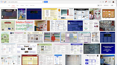
Jillian Deines went looking for inspiration for her posters the way most of us try to solve problems now. She searched on Google. Because Google customizes search results, my hits might not look exactly like hers, but this is what I got when I looked for “scientific posters” (click to enlarge):


Not exactly an inspiring collection. Then, up in the corner, it offers hope!A collection of related images on excellent scientific posters! I visiting those images, and...


Um. I can’t say these stand out as particularly stunning. At the least, most look far too dense.

The first image also offered me a chance to look at bad scientific posters. I went and looked at those, and...


Again, I don’t see a lot of differences in what’s on display in the excellent set of search results, the bad, and the generic.

The lesson here? I’m not sure. Maybe it’s that the difference between a good poster and a bad one is about the details, not the general layout. Maybe it’s that there are very few truly expertly designed posters, for reasons that I’ve discussed on the blog (scientists are amateurs at design, short time frame, and so on).

Link roundup for February 2014

Review: Slidedocs

$
0
0
Nancy Duarte is one of the best in the business when it comes to design of slide decks. After three conventionally published books on paper, she has just released her fourth, Slidedocs, as a free ebook created using, and evangelizing, PowerPoint.

To some degree, PowerPoint is Duarte’s hammer, and she’s on the lookout for nails to use it on. Previously, Garr Reynolds called annotated PowerPoint decks in place of documents “slideuments”, which he called the “illegitimate offspring of the projected slide and the written document.”While Reynolds was critical, Duarte wants to legitimize the format by rebranding it as a “slidedoc.”

Duarte believes that the traditional document is dead (except for a few niche cases), and PowerPoint has won. She argues that PowerPoint is already used for so many purposes besides slides, and that it integrates visuals and text so much better than other tools, we should use it for much routine communication within business.

Why do I bring this up on the poster blog? Because on at least one count, Duarte is right. As I’ve mentioned many times before, PowerPoint is the most commonly used software for making conference posters. I still contend that is is not a great tool for this, yet there are just too many people who know no other way, and won’t put in the effort to buy or learn new software.

Thus, the tasks that Duarte talks about in creating a slidedoc are the same steps you need to go through in creating a conference poster.

The nitty gritty for people making a conference poster begins in section 2 (slide 37), discussing the process of creating appropriate text. This is something that I haven’t given a lot of attention to on this blog, so if you’ve been looking for a discussion of that, this is a good place to start.

Section 3 (page 99) is hits closer to the sort of topics normally featured on this blog: graphic design. It talks about creating a consistent “visual language” (slide 102), the use of grids (slide 116) and white space (slide 121), and good ideas for using text (slide 127).

Section 4 is less relevant to poster creators, as it looks at how to present slidedocs. We know how posters are presented (print, carry, hang, stand and chat), and it’s not the same way that slide decks, or slidedocs, are.

Slidedoc is a self-exemplifying book. It clearly has the look of a PowerPoint deck, just one done about 1,000% better than most decks you have ever seen. It took a lot of careful effort to get it to look that good, and the same will be true of posters, too.

Making this book free is a wonderful gift from Duarte. Check it out.

External links

Slidedocs

Critique and makeover: Semantics

$
0
0
Today’s posters come from Anna Pryslopska, and are shown with her permission. Let’s see the first version of her poster (click to enlarge):


Anna created this poster, and the revision below, in Inkscape, “which was a PITA”, she adds.

After she presented this poster, Anna revised it for another conference after one of her viewers said it looked “like candy (not serious).” Here is her second poster:


This is a successful revision on many, many counts. The first and most obvious change is that the colour scheme has been lightened and brightened. That alone makes a huge improvement, because it de-emphasizes the boxes on the poster. I might have tried making the “Background” box in the upper left the same light blue as all the others.

The title and headings are larger in the revision, creating a stronger text hierarchy.

Where both posters still struggle is with the reading order. Graphs should be next to the text that describes them whenever possible, and here, they are not. Let’s put a line from each graph to the places referenced in the text:


While the graphs appear in order, they are often separated from the text by a long way. Figure 2 and 3 sit right next to each other, suggesting they will be referred to together, but instead they are discussed almost at opposite ends of the poster.

Making matters slightly worse is that the reference in the text to point to each graph (e.g., “see (1)”) is low-key and slightly cryptic. For instance, many people use numbers alone to indicate references. It might have been better to label each one as a figure, and put, “see Figure 1” in the text.


Anna concluded with some general comments.
I think a lot of the poster would be much better if we had LaTeX templates that don’t suck. My university has a corporate design one that doesn’t work. They actually paid someone good money for that... I know almost all my colleagues use LaTeX or PowerPoint for their posters and both require a lot of knowledge to make something nice and “nobody’s got time for that.”


I agree somewhat. Templates can be helpful, but the lack of a standard poster size makes creating a template difficult. I think examples are more powerful than templates, which may be why so many readers tell me they find the critiques useful.

Also, I know of nobody in my circle of colleagues who uses LaTeX. A couple of blog readers have mentioned they use it, but for the vast majority of people, posters mean PowerPoint. For those wondering what LaTeX is about, maybe try this:


I include it despite my reservations about a video titled “Learn Latex in 5 minutes” that is six minutes long.

Misplaced priorities on institutional templates

$
0
0
Commenter k brought my attention to this poster template from Iowa State University (click to enlarge).


The template gets it exactly wrong. The order of elements at the top is 180° away from what it should be.

This template reflects misguided priorities. It’s intended to do one thing: make sure the institution’s name is the most important thing on the poster. I repeat this from Garr Reynolds (my emphasis):

The logo won’t help make a sell or make a point, but the clutter it brings does add unnecessary noise and makes the presentation visuals look like a commercial. And people hate commercials or being sold to.

The most important thing on the poster should be the title. That is the most important information for people walking by at the conference. The principles of text hierarchy suggest that the title should be bigger than all other text, and at the top of the page, and possibly in colour. Instead, it’s the fourth thing on the page, small, and in black and white.

The second most important thing should be the people. Posters are social objects, meant to facilitate conversations between people. Names matter.

Department and institution names are the least important things for both the reader (who is the one this poster is for) and the presenter.

Worse, the template adds space for the conference name and the date up at the upper right. Of what possible use are those pieces of information? Presumably, people know what conference they are attending. They rarely just wander into a convention center just on a whim. And I am reasonably sure most people do not need a poster to tell them the date.

The “Acknowledgments” space at the end is a box that spans the entire width of the poster. This is not a good typesetting practice, because long lines are hard to read. Most typesetters recommend lines be about 10-12 words long.

What a template should do is to help someone make layout faster. A template that offered a precise, evenly spaced three column grid would save someone a lot of time trying to calculate the column width, including enough white space, and so on. Instead, this template has just a single word box with “Content.” That’s not helpful to the poster maker at all.

And the moral of the story is: Just because your institution suggests it doesn’t mean it’s a good idea!

Link roundup for March 2014

$
0
0
Hood Scientist takes a look at the making of this cool wanted poster:


I’m also grateful to the link to this post on making chemistry posters. It includes this video. The advice is generally sound, though I have misgivings like it assuming you will use PowerPoint (get a real graphics editor, folks!) and advising adding institution logo (although it doesn’t use the dreaded bookend).


This blog is mainly geared towards scientists, but it uses the crafts and tools developed by graphic design. Ben Lillie makes a similar case: scientists should look outside their own fields to see what others have learned, particularly in science communication. And a poster is just a communication tool, after all:

(C)ommunicating science, fundamentally, isn’t very different from communicating anything else. It isn’t easy, but the answers are out there. The textbooks are already written. ...

I believe in the value of expertise. There are people who’ve dedicated their lives to learning and teaching how to connect and communicate. Why wouldn’t we avail ourselves of that?

A menu has some interesting parallels with a poster: you both have to contain a lot of information in a logical structure that people can find. This article looks at the redesign of the menu at IHOP:

The menu IHOP ended up launching ... prioritizes images over text, with large pictures of food offerings studding the menu’s pages. It also offers color-coding—a feature meant, in part, to draw the eye toward certain food offerings and categories. Perhaps the most important change from the previous menu, though, was a grouping system that categorized food items into neat culinary taxonomies: pancakes on this page, omelettes on this one, etc.

Hat tip to Emily Anthes.

I am often telling people to leave more space on posters. Here’s a brilliant case of using space to make a point:


Hat tip to Amanda Bauer and Stephanie Stamm.

TED provides a list of ten quotes about design. I particularly like this one:

“If anybody here has trouble with the concept of design humility, reflect on this: It took us 5,000 years to put wheels on our luggage.” — William McDonough

New Scientist has an article about typefaces that, in the magazine, was titled, “Tricksy type: how fonts can mess with your mind” (paywalled). The title in their weekly newsletter was better, though. It was, “Comic Sans is evil.”


Congratulations to reader Alex Warnecke, who took the Provost’s Award in the ecology section of San Diego State University’s recent student conference. She was nice enough to say this blog helped.

Text wrapping in Publisher, or, “Why are you still using PowerPoint for posters?”

$
0
0
Alexis Rudd made the poster below in PowerPoint.


But Alexis wanted something else to make posters. I asked if she had Publisher, often bundled with the same Microsoft Office package that contains PowerPoint. She did.

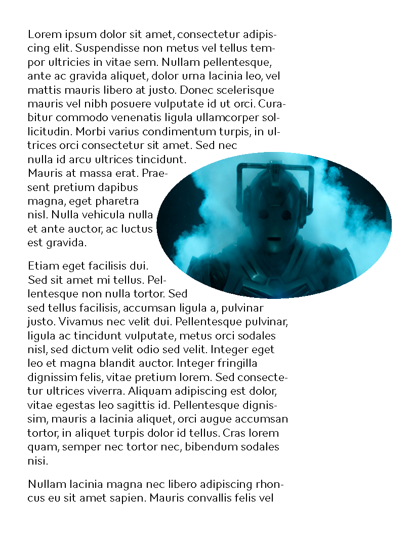
A problem with the poster above (similar to this one) is making sure elements sit nicely next to the curves. Just to give an example of how Publisher does this, I knocked out this example in a couple of minutes:


Here’s what I did. Inserted a text box with some dummy text. I inserted a picture on top of the text, and Publisher automatically flowed the text around the picture. The order is important; text won’t flow around objects underneath it.

I cropped the picture to an oval shape, and moved it away from the middle of the column. Right clicked the image and picked, “Format picture” and selected the “Layout” tab. Then I selected “Tight” as the wrapping style. And you see the results above.

It is still not on a par with pro typesetting; the large text size is creating some uncomfortable gaps. The text is ragged right; some of the jags can be smoothed out by justifying it:


Still not pro level, mainly because I can’t find any way to adjust the distance the text sits from the picture. For rectangular pictures, you can use “Square” wrapping style, and that lets you adjust the distance the text is from the object very easily.

But try doing something like that in PowerPoint at all. You will tear your hair out. Then...


Related posts

No more slidesters, part 2: Three Publisher tips

Critique: Sea otters

$
0
0
Jessica Hale tweeted this poster (click to enlarge) for the 2014 Northwest Student Society for Marine Mammalogy annual meeting with a request to make it, and I quote, “suck less”:


I tweeted these suggestions back to Jessica, which I have slightly elaborated on here.

A good design practice is to put things where the reader will need them. With only one reference, why not put it where the reader encounters it, in context: on the left column of text, instead of at the end of poster?

The “point of need” principle also means keeping related objects together. I like text describing results directly above or below figures, rather than all figures in one column. See this post for another example. Similarly, the statistical results could be put in the white space of the graphs, or in the caption, rather than in separate text in the results on the right, at some distance from the graphs.

Try removing the bullet points, and use normal sentences and paragraphs instead. PowerPoint, despite its name, often handles bullet lists fairly inelegantly, with strange indents.

Maybe the graphs could have same light blue background with no lines around them, so they would match the text boxes. This would mean picking the right colours for the graphs to match the blues. The figure in the left column might be a little more tricky to harmonize, but would be worth considering if it could be done.

Are the columns the same width? The right one looks narrower.

If you leave figures in central column, maybe you could consolidate the text boxes in the right and left columns into one box, not 2-3.

I wonder if you could have a stronger take home message. “Different otters are different” seems less memorable than you might like.

Try bolding everything you’ve underlined. As in, bold, instead of underline, not in addition to.

In a species name, “sp.” should not be italicized (see last bullet point under “Results: Season”).

Time flew! The (belated) fifth anniversary

$
0
0

Whoops! I missed it!

I have had my head down doing a lot of technical academic writing. I completely forgot about the fifth blogiversary of Better Posters at the start of March!

It is a little hard to fathom that I’ve already been trying to make conference halls more beautiful, on poster at a time, for half a decade.

That I have made it five years, and kept the “one post a week” schedule steady throughout that time, is thanks to the readers of this blog. It’s my readers who convinced me I am doing something helpful here, and have given me lots of fodder to blog about. Thank you!

Picture by Gerry Dulay on Flickr; used under a Creative Commons license.

Guest post at The Conference Mentor

Critiques: Newtown and white noise

$
0
0
This following two posters come from a contributor who has asked to have identifying information removed from these posters. The creator of these wrote:

Coming from a design back ground, research posters have somewhat astounded me.

I think you can see the design sensibilities in these. There’s a lot more thought to typography, colour, and layout than I usually see (or do myself!).

First, we have a neighbourhood poster that pulls off some sophisticated grids (switching from 2 column to 3 column layout), has good use of icons, and interesting type choices.


I would be a little concerned if this was hung in a conference session where the light was low. Some features, like white text on the light blue background, might wash out if it was in dim lighting.

The next one is notable for me because I always find “portrait” posters (taller than wide) tricky. This one uses colour to make the reading order, in bands, clear. The muted colour palette is effective and appropriately calm (for a hospital poster). The drawing of the hospital bed combined with the large and evocative type used for “White noise” is an excellent entry point. Indeed, the “White noise” is an excellent example of the beginning typesetting exercise, “Make the word look like the thing is represents.”


My concern is that there is a lot of small text there. I would be deterred from stopping at it because of that.

Link roundup for April 2014

$
0
0
I’ve blogged about digital posters from time to time, but I have yet to see or hear them done well. Das Terminal is apparently trying to position itself for the inevitable future of posters on screens instead of paper (hat tip to Peter Casserly). Here’s some of their screens:


I’m not sure of the industrial location they chose to photograph their product places it in the friendliest, or gives the impression of something contemporary or forward-looking.

This is a very interesting article about how your colour choices affect how people interpret your data.

When colors are paired with the concepts that evoke them, we call these “semantically resonant color choices.” ...(S)emantically resonant colors can enable you to take advantage of familiar existing relationships, thus requiring you to use less conscious thought and speeding recall. Non-resonant colors, on the other hand, can cause semantic interference: the colors and concepts interfere with each other(.)

Here’s an example:


Hat tip to Nancy Duarte and Harvard Business Review.

Poster Session alerts PowerPoint users to some weirdness in how PowerPoint renders purples.

The reason is that PowerPoint works in the RGB color space, and the interpretation of RGB into the CMYK colors that a printer uses is not always what it should be.

A nominee for “Best poster title of the year”:


Heh. Jon Tennant says, “Just decided this is going to be the layout for every future poster presentation I give”:


Empathy with the user! That’s the heart of Justin Kiggin’s great answer to, “Why do scientist still read PDFs of papers instead of web versions?” Because publishers keep doing this to their HTML versions:


It’s the logo problem all over again. Stop giving us irrelevant stuff.

Here’s a nice set of answers on Quora over how professionals choose different typefaces. Here’s an excerpt from the top rated answer:

“How do I choose the right font” is such a simple question yet there are so many ways to answer it. ... As a designer, you are (or should be) always paying attention to design in your environment and media. If you notice a cool typeface in something, like a movie poster or a billboard, see if you can track it down later using Google searches or WhatTheFont, so you can add it to your arsenal for future use.

Also includes a link out to bad type choices.

For some weird, strange reason, academics seem to love Comics Sans. I don’t think it’s the right choice for most academic purposes, but, if you insist on that style of typeface, why not at least get cleaned up version of it? Presenting Comic Neue, a much improved version of the most maligned typeface. (I still don’t like the serif on the capital C.) Hat tip to Mary Canady.


But an even better choice? Use typefaces created by professional comic letterers!

Critique: Irrigation and butterflies

$
0
0
Today’s contribution comes from Andrea Barden (click to enlarge):


She writes:

I used a green and blue orientated theme as to me it linked in with the theme of the topic (irrigation).

This is a good way to try to approach the colour scheme. It is always helpful to just think, “What colour do people associate with this topic?” While you might be tempted to try “something different,” the risk is that you will simply confuse people instead.

I might have tried to simplify the colour scheme a little more, perhaps by not using the photographic background. The varying colours in the background change the foreground colours in the boxes, making it look more complex than it is.

I’ve tried to separate out the most important/interesting points using the blue boxes with the blue butterflies. It’s sort of a case of “follow the blues” in a way!

I like this idea, but am not crazy about the execution. The butterflies look like decoration, not guides. To have the butterflies guide people to highlights, they need to be consistent, and each needs to be clearly associated with one thing.

But these butterflies are not consistent. The orientation of the butterfly changes. Some are next to text, and one are next to a graph.

And these butterflies are often straddling boxes or other elements; the second one from the left is particularly bad in that way. Is it emphasizing the “Diversity partitioning analysis” or “Additive partitioning”?

The biggest issue with this poster, I think, is simply the volume of information here. There are too many elements in the space, and it looks cramped. A very hard-nosed edit to focus on the most essential elements would probably help.

I do like how the references and contact information are placed in the bottom, perhaps because it is one of the few parts of the poster that is not overloaded.

Hang ‘em high

Critique: Crab burial

$
0
0
Today, I’m pleased to present an award winning poster from Emma Locatelli. This one took Council Poster Prize at the Palaeontological Association Annual Meeting in 2012. You can click to enlarge:


This is going to be a short critique, because this is a sharp, well done poster. (And I say this not just because my own research revolves around crustaceans like the crabs here!) Let’s check off a few of reasons this poster is a major successe:

  1. The poster has two clear columns, which make it completely clear what the reading order is. 
  2. The story is told with a lot of pictures and minimal text.
  3. Most things are neatly aligned with another element on the page.
  4. There is reasonable amount of white space, so that the poster doesn’t look too crowded.
  5. There’s a clear take-home message.
  6. Logos are down in the fine print where they belong!

Where might we see some improvement?


There is an implied question in the first line of the introduction, lurking like a hidden fossil:

Three primary hypotheses can explain the dearth of land crabs in the fossil record(.)

I’d state the question outright: “Why are land crabs’ fossils so rare?” This might have even been the title of the poster: shorter, punchier, and perhaps more likely to draw in curious passers-by.

The poster is set in Gill Sans, a classic typeface that I enjoy and use a lot myself. Here, though, I wonder if a more modern typeface in the same style might have made it look fresher and lighter. For example, bold Gill Sans looks a little clunky. There is a lot of bold on this poster for emphasis. I would use less bold, probably removing it from the methods completely. The more emphasis you use, the less effective it is.

While the poster does a generally good job of spacing and alignment, there are a few places that could be improved. The graph caption above “Subsurface alignment” in the results come a trifle too close to the text below it.

Similarly, it would have been nice if the figures in the methods and the results – two rows, both three to a column – were equally wide, so that the two rows of figures aligned perfectly. And there are a few other quirky spots where things that should line up or be closer to each other are not. 

There’s one tiny typesetting inconsistency. The last list item of the introduction ends with a period, but none of the other sentences in lists end in periods. This is such a small thing that if someone pointed it out to me, I would joke that it’s there to avoid offending God, because only God is perfect.

Critique and makeover: Zen microbiome (no relation)

$
0
0
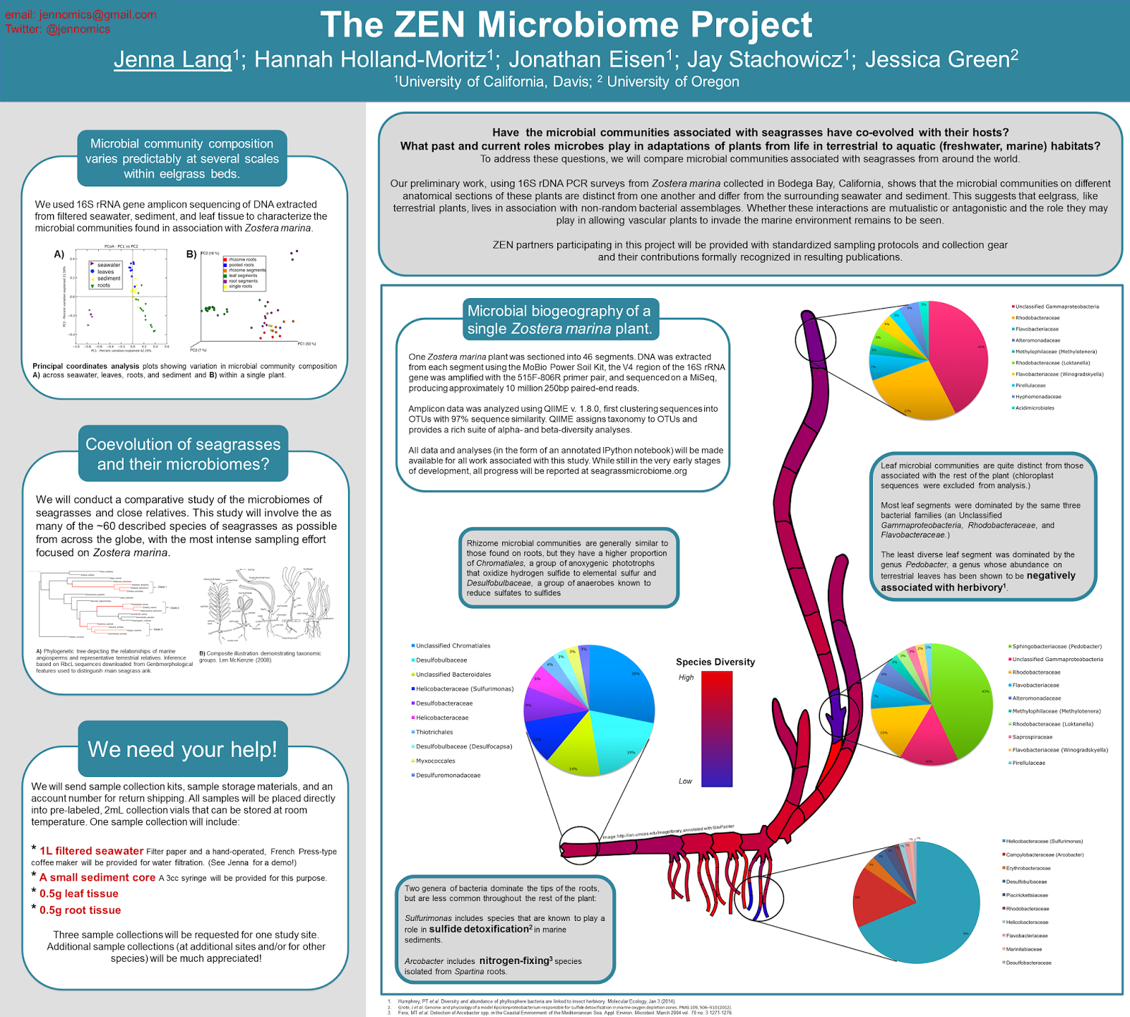
Today’s sharing come from Jenna Lang, and is used with her permission. Click to enlarge:


This poster has a different goal than most of the posters here. It’s a recruiting tool, not a research report. I’ll let Jenna explain (slightly edited):

I am a microbial ecologist. Historically, members of our lab all attend the same conferences and interact with the same people. Lately, I’ve been doing things a little differently.
This poster was presented at a gathering of partners in a big network of seagrass researchers (see zenscience.org). These people work at sites all over the world, they speak many different languages, and English with many levels of proficiency. They are marine biologists, and spend their days on boats and in SCUBA gear, and thinking about large-scale ecological questions. They know NOTHING about what my lab does.
I attending this conference because I want to know what kinds of microbes are living in their seagrass beds, and I want them to send me samples. Sample collection is super simple (something I want to emphasize) and the role of microbes in seagrass beds is entirely unknown (although we assume it will be important.) I wanted to keep this poster free (as much as possible) from jargon, to present just enough data to show what types of things we can learn, and to provide a few figures that I can reference when talking to them about the overall goals of our project and to the diversity of seagrasses at their sites (thus the phylogenetic tree and the illustration of various seagrass types.) I also had some props with me (a water filtration device and some collection tubes and a storage box.)

When I presented this poster it went over very well. People are very excited to work with me and very willing to send me samples. I look forward to presenting this “recruitment tool” at other conferences in the future.

Despite the title, the original poster didn’t have much of a Zen aesthetic. There was just a little too much going on. There were a lot of lines and thick boxes. The credits were fighting for attention in the title. Some sections were centered, others were left justified, for no apparent reason.

In editing, I tried taking out the trash. Mainly, this meant removing, or at least lightening, a lot of the lines in the boxes. Let the colour differences define the space, rather than heavy lines.


I think lightening up the poster helps.

A recruiting poster has a goal of bringing in those who know nothing. That “We need your help!” is visible, even at this reduced size, helps achieve that goal. But I am still concerned that this poster may be a little too complex and intimidating to bring in casual onlookers.

Critique: Visualising sound

$
0
0
In my grad program, we had a grad school departmental seminar every year, where all students would give 15 minute talks on their research. The first year students often gave some of the best talks.

This wasn’t because students got worse as presenters as they went through the program; it was because the incoming students only had project proposals. That weren’t trying to cram everything into a short amount of time.

I am reminded of this because today’s contribution, from Benjamin Gorman, is also a proposal (click to enlarge).


This is an attractive, approachable poster. The first thing that pops out about it is the attractive and consistent colour palette. If you had said, “green and pink” to me, I don’t think I would have expected it to work as well as it does here. My concern, as usual for posters with coloured backgrounds, is how well it will read if it’s in a room with less than ideal lighting.

The use of large images throughout is also a factor in this poster’s attractiveness. They are simple, concrete, and easily recognizable. Again, this is an advantage of having a proposal: you don’t have graphs of data, which are almost always abstract.

While I normally rail against boxes, they work here, for a couple of reasons. There are not many of them. They are light, rather than dark.

Each row contains two columns within it. Normally, I would suggest that these be equally wide. But here, the size of the images, particular of the glasses in the middle, dictate the space the text flows in. Forcing the columns to be equally wide here would require squashing the images in the middle, and I think the result would be less interesting than it is here.
Viewing all 644 articles
Browse latest View live


Latest Images