Quantcast
Channel: Better Posters
Viewing all 644 articles
Browse latest View live

In search of simplicity, plus a makeover

$
0
0
In a blog post on The Conversation, Jordan Gaines Lewis extols the virtues of simplicity, both as a viewer and presenter:

Also, forget the wordy background information, paragraphs and long conclusions – when I look at your research poster, I’m only looking at the title and figures. ...

Nowadays, when I design posters or oral presentations, I aim to do the same thing regardless of whether I’m introducing my work to scientists or non-scientists. My research posters, in fact, are almost laughably simple. Well under 200 words, with large, blocky figures, at first glance they may resemble a high school science project – certainly not a typical graduate student’s work at an international conference.

But the human brain is attracted to simplicity. Since applying what I’ve learned from being a science communicator, my conference poster experience has completely changed. I’m frequently bombarded by a non-stop stream of scientists from all different fields, never having more than a free minute or two to sneak a swig of water. The best part is that because they understand what’s on the paper, our discussions can go deeper.

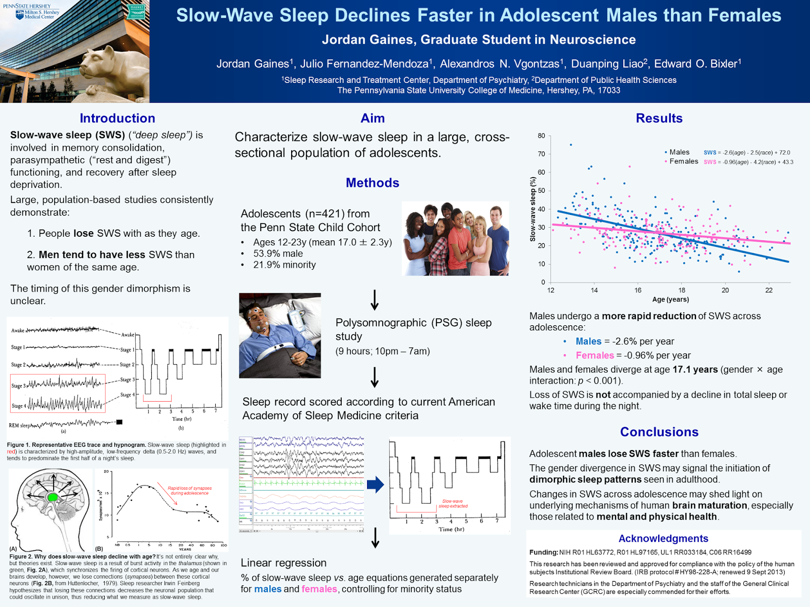
I was struck by Jordan’s description, and asked if we could see an example of her work. She was kind enough to send one of her examples. Click to enlarge!


Jordan’s poster is indeed simple: this poster has one result. It succeeds in that anyone looking at it will think they can get the main messages of the poster in a few minutes.

I asked Jordan to talk about this poster, and I was delighted she replied with much more than I could have reasonably expected:

A few years ago, when my first scientific conference was around the corner, I couldn’t wait to make a poster. I was awed by those with complex titles, long-winded methods, and tons of detailed graphs. To me, this style reeked of intelligence, complexity, and months of hard work. I wanted to show off, too.

…until I went to my first scientific conference, and I found myself avoiding these types of posters like the plague.

We humans like simple things. And especially in a hall filled with hundreds of posters (and ten times that many people milling about), our eyes want to focus on the least chaotic item in the room and find comfort there.

My style of designing posters changed dramatically after I participated in Penn State’s Graduate Exhibition last year—a school-wide celebration of graduate work in all disciplines, from theoretical physics to visual arts. Our posters are judged by professors, students, alumni, and volunteers from the Penn State community who come from all different backgrounds and areas of expertise. Our work must appeal to (and be understandable by) everybody.

Distilling a year’s worth of work into an easy-to-understand poster was not a cakewalk. Eventually, I settled on a single figure, a flow chart to visualize my methods, and an image to complement my background information. The text was large and the colors were simple.

As I spoke, I found it easy to carry my judge along the way while pointing out images and figures. This experience was a revelation to me: the poster is not the centerpiece. Rather, it’s the accessory to the story that comes out of the expert’s mouth.

Despite this positive experience, I was a bit nervous to re-use this simple poster a few months later at an international conference specific to my field of study. As I hung it up in the morning, it looked laughably simple next to the surrounding posters.

But when the poster session time rolled around, attendees were drawn to mine like flies to honey. To me, the best part was that since the methodology and results were so clear from the poster, I didn’t have to waste our time by answering clarification-type questions. Instead, our conversations could go deeper—about further experiments, implications for the work, and how my findings relate to the field at large.

The goal of your poster is to inform, not impress. Teach, not overwhelm. It’s harder to cut down words than it is to copy/paste from the Methods section of your latest publication.

Poster-making is truly an art form—some people are naturals, and others need assistance even after decades of presenting their work. I’ve still got a lot of learning to do myself, and I can’t wait to prepare for my next scientific conference.

Allot yourself a bit of extra time to design your next poster. Have a layperson take a look over it before you print it. Give simplicity a try. I have a feeling you’ll find yourself having more quality discussions with more scientists at your next meeting.

Because I am a tinkerer, though, I thought I would see if there were some things that might make things even better. Jordan described her style as “blocky,” so I start, as I often do, by removing boxes, first around the main text blocks:


Then I pulled out the boxes around the inner images:


Then I went in and tried to harmonize the text, by making a little more room around it, and making the sizes more consistent. I also removed the white fill in some text boxes to allow the pale blue background to come through.


Then a few more text changes, notably to the title. And I got rid of that last box in the figure legend.


Better Posters on the road: The MEOPAR workshop

$
0
0

I spent the first part of last week in beautiful Québec City giving a poster workshop for MEOPAR. I’d given presentations about making posters before, but this was the first time I’d tried to turn this into a half a day workshop, which was intimidating. The participants (dubbed “Meopeers”) were good sports about it all.

One of the things that made the job easier was that several of the Meopeers brought posters with them. As it happened, between the five there was a good mix of different features to talk about. These five posters gave me the chance to talk about logos, abstracts, eye levels, reading order, entry points, and much more.

This first was one of the cleanest, simplest posters. I would have put the right picture above the text, not below it, to bring the great picture closer to eye level. I also might have tried paragraphs instead of bullet points.


This second poster has a clean three column layout, but the amount of text is truly intimidating. The introduction – the whole right column, if we’re honest – is not welcoming to a casual passerby.


The poster above got caught in a lighting “dead zone" much of the first day. There were lights on to the right of it, to the left of it, but not above it, and it was noticeably dark. Compare the lighting of the middle poster to the two flanking it. 

 
This demonstrated that posters are not always displayed in good lighting conditions, and lots of conference poster sessions are in hotels like this one.

On poster number three, there are a few unnecessary boxes around the columns of this one. The logos here throw off the nice centering of the title, so I suggested left aligning the title and leaving the logos where they are.


The colours of the graphics are all over the map. This is a situation where I don’t know if the colours can be harmonized while keeping the scientific content intact, however.

This fourth one tries to provide skimming readers with a quick entry point, with a box that reads “Goal” in the upper right corner. The box is a bit dark and hard to read, though. Points for concept, but penalties for execution.

 
A couple of other issues here are that all the graphics are corralled at the bottom, and are rather small. The reading order switches around, with the central two columns reading across then down, instead of down, then across.

This fifth poster had the best title bar of all of the posters. The picture of the ferry is an excellent entry point, the title is big and clear and not crowded, and the logo is appropriately low key, tucked away in the lower right of the title bar.


Then, the bottom falls apart. The left column is okay, but... that right hand side. Oh dear. As soon as you hit the Methods and Results, you’re awash in a sea of small, intense graphs. Even after two straight days of looking at this poster on and off, I still haven’t been able to which way I am supposed to read the figures without going in and studying each one in detail, like these Meopeers were doing:


Some of the points that came up in discussion was the difference between the intended order of information, and how people actually looked at the poster. Even the first three posters, with a clear three column order, we're not often read in that order.

Several Meopeers admitted to being “skimmers,” looking at the start and finish of the poster for the main points, and not bothering with with the stuff in the middle at all.

There was some contention about the use of logos. One participant said, “My university will insist that they be there.” I am still baffled by how an institution can stop you from doing whatever you want with a poster. Even then, like everything else, there are some ways to include logos that are better than others.

I thank all the Meopeers for their willingness to listen. I thank the MEOPAR coordinating team for inviting me back home to Canada (first time home in seven years) and being most excellent hosts. I hope it helped!

Link roundup for February 2015

$
0
0
Miss Mola Mola has our latest contender for best poster title:


However, there was differences of opinion on this:

Apparently one judge scolded him and told author it was inappropriate.

I think the title is awesome and the judge is being a sourpuss. What do you think? Have your say in the comments!

And we have a second contender this month for best poster title! Paul Coxon wrote:

I learned if you want people to talk you about your conference poster, give it a bold/intriguing title.


When I ask someone with a beautiful poster at a conference how they made it, a high percentage of the time, the answer is, “Adobe Illustrator.” It’s powerful, but not easy to learn. Gary Poore has a guide to how to make line drawings in Illustrator here.

This is a fascinating discussion of sound effects in comics, where “catch” can be a word or a sound effect:

(S)ound effects are loaded with more information than just what a thing sounds like. ... they can often clarify the events in a panel by enhancing an action that is hard to capture in a still image. A sound might suggest degree or severity, for example, of an impact.

Emilio Bruna shared this interesting variation on a poster from grad student Christa Roberts:


It’s a good reminder that in a poster session, there are few rules!

A review of how decisions about typesetting can make text more readable, particularly for dyslexics. The two big take-aways: make the letters bigger and the lines shorter. Hat tip to Chris Atherton.

Are posters a visual aid, or a stand alone document?

$
0
0
Jason McDermott has an excellent question:

SciTweeps - which camp are you in? The A) “poster as a visual aid to a presentation w/minimal text” or B) “poster as a complete manuscript”?

There are some definition issues here. When I hear “manuscript,” I think that implies a journal article. That, to my mind, is way too detailed and too much stuff. A poster is not be a journal article and should not necessarily follow its conventions.

The other part of option B, though, is “complete.” As I’ve said before, a poster should be self-contained. It should present a complete narrative that does not need a speaker to guide you through it or explain it. A poster should be more than just a billboard or decoration; a poster should have substance.

I am intrigued by the responses. Most responses favoured minimalism.

I prefer (A), but there should be enough text for the reader to understand the results without you being there - Kelsey Wood

A, always A - Auriel Fournier ‏

A. Always! That's the difference between a poster and a journal article. Posters are for work in progress. Publish once done - Matthias Lein

The contrary point of view is interesting, though:


I don’t want your song-and-dance routine, I want your data; plus, what if you're not there when I am? - Bill Hooker

90% A, 10% B. (Some things really need text.) - Chemjobber

Depends on venue. If you never leave poster, A. Otherwise, needs enough B for people to critically evaluate. - Peter Thompson

Noah wanted to dig deeper:

Can’t we split the difference? C) "poster as cues to provoke interesting questions, answer boring ones."


And from there the conversation went all Game of Thrones:

We already suffer about as much carnage as G.R.R. Martin’s characters - and about as much job security. - Jason McDermott

“The red conference” - noah ‏

Book 1: “A trial of tenure.” Book 2: “A lack of funding” - Francois Gould

Related posts

Containment

Picture by char booth on Flickr; used under a Creative Commons license.

The Capra principle

$
0
0
At the most recent Oscars, Ben Affleck quoted this man, legendary director Frank Capra:


Capra said:


There are no rules in filmmaking. Only sins. And the cardinal sin is dullness.

Despite being a bit of a movie nerd (I paid my way through university working mostly as a movie theatre projectionist), I’d never heard this quote before, and love it. And t applies so well to conference posters as well as films.

About the only rule about poster making is that your poster has to fit within the allotted space. Beyond that... you have free reign.

Yes, conference organizers may tell you that you need to have an abstract. An institution may grumble about whether you have the institution’s logo on the paper. But I have yet to hear anyone say that they were stopped from presenting a poster because of such thing. I often joke, “There are no poster police!” or “Let anarchy reign!”

But... as Capra knew, “no rules” does not mean everything is equally good. Some ideas are better than others, or work better in some contexts than others. And like movies, a dull conference poster is – in either the content or the design – is a sin. The good news is that dullness is only a venial sin. You can do your penance by making your next poster better.

Critique: Inexhaustible sediment

$
0
0
Today’s poster comes from Sokratis Papaspyrou. As always, click to get a closer look!


Sokratis notes:

It was designed and made in two days... could be better (always). I used a colour wheel  to select the colours and made use of the “circle draws attention” trick I read in a book and also read in one of your posts.

Sokartis’s deliberate consideration of the use of colours and circles both pay off. Both features work very well. I would have tried making the position of the “callout” circles more consistent. The two left circles just don’t agree on a pattern.


There could be two ways to achieve this. Either you could place them all in the upper right corner:


Or, you could place them all by the margins:


I slightly favour the third of these, but the difference is minor.

The other thing that you might see in my mock-ups above is that I tried to make the blue boxes the same width as the others in the column.

While I’ve stated before that a reader should be able to follow the reading order of a poster without arrows, I don’t mind their use here. I think it’s because apart from the very first transition from the “Premise,” you’re simply moving down the page. The brush strokes used for the arrow bring an nice organic touch.

The only other small thing that comes to mind is to remove the underlining from the headings and author list.

Finally, this poster benefits from simplicity. It has very little text. It has clear highlights in the circles to help browsers through the poster quickly.

Related posts

The eye loves the circle
Don’t hold my hand
Undo the underline

Posters at the front of Science

$
0
0
It’s a little unusual to see posters mentioned in one of the magazines that likes to position itself as a “journal of record,” namely Science. Here’s what editor in chief Marcia McNutt had to say on posters, which should be familiar advice to all readers of this blog.

I encourage students to request a poster presentation at a large meeting. This format can be less stressful than speaking in front of a large audience. Furthermore, the student personally converses with members of the scientific community who share an interest in his or her research. The back-and-forth is good training and a reminder to students that discussing their research with experts or nonexperts should be a two-way conversation. Another advantage of presenting a poster is that the student can tailor the narrative to the interests of whoever stops by, in a Q&A exchange. I recall years ago when a graduate student was disappointed that her research would be described “only” in this format, until one of the giants in her field spent considerable time at her poster to discuss the work. As he left, he said, “I wish I had thought of that.” She was later hired into his department.

To be effective, posters need to be eye-catching as well as informative. In a convention hall lined with poster boards, scientists will bypass those with large blocks of texts and tables of impenetrable numbers. A cartoon that summarizes the model or findings, attractive displays of data, and photos that illustrate the experiment are good ways to grab attention. Creative ways to display pertinent information are a definite plus. I personally like posters that begin with the motivation for the work and end with the findings, areas for follow up, and broader implications of the results.

McNutt goes on to say:

Training the next generation of scientists to communicate well should be a priority.

This statement causes me a little exasperation, because I hear, “We need to train young scientists to...” more often than the chorus of a top 40 pop song.

“We need to train young scientists two write better.”

“We need to train young scientists to talk to the media.”

“We need to train young scientists to do better statistics.”

“We need to train young scientists in ethics.”

“We need to train young scientists in grantsmanship.”

“We need to train young scientists about social media.”

And everyone is convinced that this training is an urgent priority. To borrow a phrase:


I do completely agree with McNutt that the more established faculty have an important role to play here: go the the darn poster sessions. And don’t just chat with your conference buddies!

And researchers attending meetings should take some time to judge a few student papers, visit student posters, or attend student talks.

Reference

McNutt M. 2015. It starts with a poster. Science347(6226): 1047. http://dx.doi.org/10.1126/science.aab0014

Link roundup for March 2015


Critiques: Icy bodies

$
0
0
Today's poster is from Terik Daly, and was presented at the last Lunar and Planetary Science Conference. As always, click to enlarge! Enlarging always helps, but this one is particularly enhanced by increasing the size a bit.


My first thought was, “This is going to be a short critique.” That this was a crisp and professional design leaped out right away.

This poster makes excellent use of a grid, with plenty of space between elements.

The typeface is either FF Din, or something very near to it. FF Din is a typeface that is used quite often by professional designers, but almost never by scientists, because... it’s not a standard font in Microsoft Windows. The Din fonts were originally designed for railroad signs, so they have the advantage of being legible from a distance, and are quite compact, too, which is a nice combination for a poster.

While my dislike of logos in titles is well documented, Terik does it right here.The logo is occupying a space that would otherwise by empty, so it is not chewing up any valuable poster real estate. The logo is transparent, leaving no identifiable “box” fingerprint around it. The logo sits comfortably in the poster, rather than fighting for space on it.


I like the idea of having the short summary below the authors’ byline. The problem here might be that the summary is a little too similar to the title bar above it. It might benefit from being a different colour, or something to make the text “pop” to let readers quickly identify this as the main text, not the sort of mostly minor details you normally find under the authors’ names (institutional affiliation and the like).

The only thing that is a genuine error, in my view, is in the top central graph, where one of the data labels crosses the X axis. The label just needs a slight nudge upward, and it would be more readable and attractive without sacrificing any clarity of which line it’s associated with.

The poster is a little drab right around eye level: it’s black and blue text right across the board where my eyes will glance first, under the title bar.

I like images on posters, and would like to see the pictures here play a more prominent role on the poster. Unlike some posters, I don’t know what I would change on this one to make that happen. There always is another way, naturally, but in this case, it would probably demand a wholescale editing and reworking of the text. The overall layout is so clear that I’m hard pressed to imagine this poster in any other way.

External links

FF Din

Belated blogiversary: six years on

$
0
0
 
Wow, I have been so busy recently that I completely blew past the sixth blogiversary of Better Posters! (The proper blogiversary date was the start of March, not, um, April.)

That this blog is still as active as it is today is thanks to many, many contributors who have been generous enough to share their posters. Thank you all.

Photo by kathryn on Flickr; used under a Creative Commons license.

Critique: Build a better turbine

$
0
0
Today’s award-winning poster is courtesy of reader Jennifer Rinker. It was presented at the CU Energy Frontiers conference, where Jennifer walked away with the win in the “Electricity Generation and Storage Category.” Click to enlarge!


Jennifer writes:

At one point I was chatting with one of the judges briefly, and he enthusiastically told me I was getting full points for clarity.

I can see why. This is very clear.

The clarity is even more impressive because the poster uses a slightly unconventional layout: two horizontal sections, subdivided by vertical columns. While removing lines is often one of the first things I do to improve a poster (see below), the horizontal line here provides a clear cue of how to read the poster. It also serves the role of “grounding” the figure of the turbine, so it isn’t floating in space.


Because this poster has such a light touch – ample spacing, subdued colours, fine lines – the table near the center surprised me a bit. The table is emphasized in three ways:

  1. It’s printed in large, thick letters;
  2. Against a darker background, and;
  3. Inside a box.  

Any two of those are probably enough to highlight the table. I tried taking away the lines of the box:


The table harmonizes with the rest of the poster much better without the box. I’d perhaps increase the contrast between the table’s background and the background of the rest of the poster.


Cream and off-white colours are very attractive for posters, perhaps because they mimic the look of printed pages in books, which are rarely perfectly white. I would be tempted to go just a hair lighter in case this poster was someplace the lighting was bad. I tried a quick and dirty colour replacement. This wipes out some of the fine lines, alas:


I’m also pleased to report that this blog – and, more importantly, the many people who have shared their over the years – had a small part in this poster. Jennifer wrote:

I designed it based on a lot of your critiques and comments on poster blog. ... I was inspired by some of the really fantastic posters on your blog.

All part of the service!

Variations on a theme: crayfish nociception

$
0
0
Back in 2010, I had just co-authored a paper on crustacean nociception with Sakshi Puri. At the time, we had already started the follow-up experiments that have just been published.

Now there was a bit of a gap between the two papers, which means that this research was presented at quite a few conferences. Six of them, all told. Click on any to enlarge!

The first poster in the series was for the International Association of Astacology in 2010. This one shows how many of the experiments that made it into the 2015 paper were already in the can (to borrow an old movie making phrase) back in 2010!

Graphically, the red used in the central graph in the middle was picked up from the colour of the crayfish in the pot on the upper right. The greens used in the headings were picked up with an eyedropper from the colour of the wasabi.

While the crayfish boil provided a nice illustration of the question that initially motivated these experiments, it’s hard to make out that they are crayfish from a distance. The rest of the posters have big pictures of individual crayfish, or their close relatives, lobsters.

Later that same summer, I attended the Ninth International Congress of Neuroethology in Spain. This one is different from the others for two reasons:
  1. It was the only one in portrait format (and a fairly small total size, too). I’ve heard fairly consistently that posters for European conferences are portrait more often than North American conferences.
  2. It was made in PosterGenius (reviewed here) rather than Microsoft Publisher.


I switched from the picture from a shot of many crayfish in a pot to a single lobster in a pot. As a result, the colour palette for this poster completely changed. The lobster is greys and blues, so the graph and headings are those colours, too.

Making this in Poster Genius was a challenge, because I recall it being difficult to adjust the size of the text. I couldn’t use my usual trick of making the text for the references smaller, so I struggled greatly to make everything fit. As a result, this poster came out rather text heavy.

The following summer,  in 2011, I went to The Crustacean Society meeting. We had done more experiments over the year, and this was the first appearance of the behavioural responses to high temperature stimuli. Video gives a much better sense of the behaviour than any graph, so this was an early appearance of a QR code that people could scan to watch the video. I don’t recall many people using it.

This was also the first appearance of the title that my co-author, Sakshi Puri, wanted our paper to have, and which ultimately became the title of the paper. When we started the experiments, I’d joked with her that I’d wanted it to be, “Do crayfish like spicy food?”

I also think Sakshi asked for us to set the poster in Time New Roman rather than sans serifs.


I think of all the posters, this one is, in some ways, the least successful. There was a lot of space at the bottom that are filled with pictures that could go anywhere. And the spacing between the habanero and wasabi pictures is a little too wide. The colours used for the spikes are a little bright.

I was pleased to have found a lovely crayfish picture from Michael Bok that appears on several later posters. 

In fall of that year, we took this project to “the big show”: the Society for Neuroscience meeting in 2011. (Sakshi blogged about her experience here.)


This paper is a little reminiscent of the first one in this series, in that it uses a lot of red for graphs and headings. The heading here was a font called Orial that has some nice detailing, although in retrospect, it was a little too subtle for people to notice.

People scanned the QR code a lot, according to Sakshi.

This meeting was important, because another poster at that meeting had a technique for studying responses to low temperatures, using dry ice. We did that experiment soon after, and it made it onto the next iteration of the poster.

In 2012, I presented at the Tenth International Congress for Neuroethology.

I was proud of the use of the two callout boxes in this one. I thought the light red backgrounds were sufficiently different to signal that these were not part of the main narrative, but subtle enough not to be distracting.


I did away with headings, using drop caps as another way to signal sections.

While the QR code still appears with a link to a video of the behaviour, that was purely a backup. Most of the time, the code was covered by my new iPad that I stapled to the spot. I carefully designed the code and the text so that it would not be seen when the iPad was on top of it. This meant that much of the poster was designed around how big my iPad was! The width of the iPad helped determine the column width, and therefore how many columns the poster would get.

One of the big sticking points in publishing the paper was trying to get neurophysiological records from the claw, which are shown on this poster. These didn’t make it into the final paper. Ultimately, that proved too hard to get good recordings, so we went back to using the antennae, which we’d used in our 2010 paper.

The final version of the poster appeared at the Society for Integrative and Comparative Biology meeting in early 2014.


I was happy with the picture I found as the entry point. I love the expression on the woman’s face, and it perfectly reflects why people are always asking about, “Are lobsters / crayfish / crabs / shrimp hurt when they’re cooked?”

Again, there are reds in the graphs throughout, because of the colours in the animals and the Nature article screen grabs.

While I often rail against boxes, I tried them here. I think they work because rather than putting a box around each individual part, I used the boxes as column separators. I’d seen this done occasionally in magazine and newspaper layouts. I went for extremely light lines (they look finer on the poster than in the image here).

When seen all at once, in this small format, several of them look a bit busy because of the physiology recordings. They often look very busy, and they use a lot of colours. The last two posters perhaps fare a little better because they don’t have those complex charts.

In looking at these again, I am pleased to see what I think might be some progress. The last two are, I think, a little more successful than the earlier ones. After all, for the first ones, I’d only been blogging about poster design for about a year. By the time I did that last one, this blog was closer to five years old.

Do you have a favourite?

Related posts

Small conference, big conference
iPoster

References


Puri S, Faulkes Z. 2010. Do decapod crustaceans have nociceptors for extreme pH? PLoS ONE5(4): e10244. http://dx.doi.org/10.1371/journal.pone.0010244

Puri S, Faulkes Z. 2015. Can crayfish take the heat? Procambarus clarkii show nociceptive behaviour to high temperature stimuli, but not low temperature or chemical stimuli. Biology Open: in press. http://dx.doi.org/10.1242/bio.20149654

Link roundup for April 2015

$
0
0
While this blog is mainly about poster sessions, poster sessions happen in the larger context of academic conferences. I love conferences, and part of the reason I write this blog is so that people can have good experiences at those conference sessions. Those good experiences do not include harassment. That’s why this blog post by Timothée Poisot is this month’s must read:

Across all ecologists we surveyed, 37% witnessed harassment, and 24% experienced it, at least once, only taking into account what happens during scientific meetings. This… wow, this is a lot. ...

1 out of 3 people is not an epi-phenomenon.

The post also shows strong support for organizers to be much more active in dealing with harassment. If you’re involved in organizing a conference, there are steps you can take to make them better and more welcoming. Take them.

I’ve often lamented that most posters are designed by amateurs. I have rarely seen a case for using professionals as compelling as this ad, which was a full page in several American newspapers:


It’s an attractive and well designed ad. Except for one thing.

The brain is backwards.

Not being able to get a brain the right way round is not the signal you want to send when you are trying to announce a “new era of discovery in brain research.” There are professionals who do medical illustration stuff for a living. Hire one. (Hat tip to Mo Costandi.)

The bar graph is a standard way of presenting data. A new PLOS Biology paper argues that it’s a bad way regardless of its ubiquity. Hat tip to Gaetan Burgio and Michael Hendricks.


Nevertheless, the humble bar chart is likely to remain a major workhorse for data presentation for a long time. Here is a short list of good tips. Hat tip to Garr Reynolds.


I Want Hue bills itself as a tool for “data scientists.” Its claims:
Distributing colors evenly, in a perceptively coherent space, constrained by user-friendly settings, to generate high quality custom palettes.


Looks interesting. Not sure why the colours jiggle when you make palettes, though. Hat tip to Dean Malmgren and Justin Kiggins.

I’ve always been skeptical when I’ve heard mathematicians and others wax rhapsodic about the “golden ratio.” This article calls it “design’s biggest myth,” and I­’m inclined to agree. But maybe that’s just my confirmation bias. Hat tip to Tommy Leung.

Peter Newbury asked:

Conf poster style question: do you use present tense, as in “results are calculated by...” instead of “results were calculated by”?

This isn’t just a conference poster question, but a general scientific writing question. In general, any methods are in past tense, because you’re describing something that already happened. Results are often in present tense, because the effect you’re describing should be generalizable to past, present, and future situations. To put it another way, we write “E is equal to mc squared,” because it’s always true. You might write “E was equal to mc squared” if it was only true once.

Graphic designer Ellen Lupton has a book coming out in June that was an instant pre-order for me: How Posters Work.


Expect a review as soon as it arrives and I devour it, as I surely will. There is an art exhibit to check out if you’re in the New York area.

Haas Unica is an old typeface that has been made new again. It’s the sort of sans serif workhorse that works well in posters. Hat tip to Timothée Poisot and Genegeek.


Jarrett Fuller ruminates on his love of all sorts of posters, not just academic ones.

Throughout history, you could group posters into three purposes: to inform, to persuade or encourage, and to commemorate. Sometimes it straddles the lines between each of these, but the poster’s purpose must always involve one of them.

Alex Holcombe wants you to know this.

Each word you put on your poster reduces conference-attendee approaches by 0.2%. People need to know my invented statistic.

Now they know, Alex. Now they know.

Announcing the #SciFund poster class!

$
0
0
I’m very excited to announce a new poster making class, sponsored through the #SciFund Challenge!

#SciFund started out as an experiment in science crowdfunding, but has expanded its mission to include science communication and professional development.

In this class, you’ll learn basic design principles, be instructed in how to use Adobe Illustrator (a powerful, vector-based graphics kit), and build your communication skills. And yes, you will make a poster!

Because we want class participants to make something that is useful to them, we ask that you have a research project with data or a research proposal. This might be a project you are presenting at conference this summer, or, if you’re an early career academic, might be a proposal for a thesis or dissertation. We also ask that you have access to Adobe Illustrator.

The class runs five weeks, starting Sunday, 7 June 2015 and running through Saturday, 11 July 2015.

Unlike some online classes, where it’s just you and the computer, this one has lots of meeting time with moderators and other class participants. The main moderators will be Anthony Salvagno and me (Zen Faulkes).We expect participants will put in about 5 hours a week for their assignments. We will also have hangouts (group therapy for poster design) and some group work for review and feedback.

Participants should be generally available between 10:00 am and 10:00 pm Eastern time to be in class hangouts and other events. (Multiple time slots will be available to meet.)

People who successfully complete the course will be given a certificate of completion.

The cost will be$50, and registration will begin soon. The last #SciFund class on video making filled up, so watch this space, follow the #SciFund hashtag on Twitter, and the main #SciFund page for more details.

Register now for #SciFund poster making class!

$
0
0
The poster design class I mentioned last week is now ready for you to sign up! Click here to register for the class!

The official announcement on the #SciFund blog has a few more nitty gritty details.

This is the first time we’re charging for a #SciFund class (US$50), so I’d like to address is a question I’m sure many people will ask:

“What am I getting for my money?”

Valid question. After all, I’m one of the instructors, and this blog exists to spread ideas I have about poster design around for free. If someone read all the entries in this blog, you would probably have a very good idea of some of the things I’d be talking about in the class.

One benefit of the class is that you’ll be able to have a lot of interaction with the instructors. It isn’t just me leading the class; I’ll be joined by Anthony and Jai. And while a blog is static, working in the class will not be.

Perhaps more importantly, you will get to have a lot of interaction with other students in the class. In a class like this, the opportunity to get the ideas and feedback of others can be invaluable, because different people bring such different ideas about style.

Another thing that you get from being in the class is that we do have plans to offer a certificate of completion for those who make it all the way through. This could be useful in demonstrating that you’ve been engaged in professional development activities.

Once again, you can click hereto register for the class! I hope you will join us!

Bullets versus sentences

$
0
0
Some other resources on poster design recommend that people use bullet lists extensively for their posters. I advise against it, most of the times.

The pros of bullet lists is that by their nature, people tend to write less text. That concision is very useful on a poster, I admit.

But I want to argue there are more negatives to using bullets that positives.

First, my experience with looking at PowerPoint slides is that people are inconsistent in how they type bullet lists. For example, people often punctuate some bullet points with a period, but leave others without a period. When people write sentences in paragraphs, they will put a period at the end of every sentence.

Second, the size and spacing of bullet points is often badly done in software. Even PowerPoint, the culprit that made bullets ubiquitous, doesn’t scale well when you move outside of the standard slide sizes. Here’s a quick mock-up for a four foot wide poster with a bulleted list (click to enlarge):


Under this default scheme, the bullets are too far from the text. The spacing between lines and points is also a little dodgy. Microsoft Publisher, which I use a lot for posters, handles bullets even more poorly.

Third, bullets destroy narrative. Edward Tufte has made a thorough analysis (from The Cognitive Style of PowerPoint, excerpt quoted here):

Lists can communicate three logical relationships: sequence (first to last in time); priority (least to most important or vice versa); or simple membership in a set (these items relate to one another in some way, but the nature of that relationship remains unstated). And a list can show only one of those relationships at a time.

Bullet lists may be more concise, but they are impoverished compared to sentence in paragraphs. Sentences can express many more relationships.

Fourth, readers are trained to read sentences in paragraphs. It is the most common thing we read, and is how we expect to absorb complicated ideas.

This is not to say that bulleted lists are useless. They are completely appropriate for short lists. A poster, though, should be more than just short lists. For example, I feel okay about using a bulleted list for a quick summary of my case again bullet points:

  • Bullets are used inconsistently
  • Bullets are poorly typeset
  • Bullets show relationships poorly
  • Readers used to sentences

I don’t think I would convince anyone of my argument if that list were all I posted.

External links

The Zen of Presentations, Part 41: Consistency

Photo by David Stillman on Flickr; used under a Creative Commons license.

Critique: The final four

$
0
0
It’s long past March, but poster design knows no season! This week’s poster comes from author Cameron Fuqua, and is used with permission. Click to enlarge!


In a reversal of the norm, the tables – usually one of the things I like least on a poster – are one of the best things on this one. The tables avoid the “data prison” problem: that is, too many lines encasing each cell. The colour banding to distinguish rows is subtle. The gradient fills provide a little emphasis for each cell, but are not distracting. The silver gradient fills for the text boxes are also well done, providing some visual interest that is not distracting.

I wish that aesthetic extended to the rest of the poster.

The rest of the poster is confined within thick, heavy-lined boxes. The poster would probably be significantly improved by thinning or removing the lines entirely.

Worse, they’re boxes with rounded corners. The rounded corners brings the lines of the box closer to the text, which is already a problem. There is no space between the text and the lines, particularly in the upper left boxes. Further, the rounding isn’t consistent. Some corners are quite curved, others are closer to right angles.


I like distinctive typefaces for titles and section headings, but this one (something in the Eurostile family, I think) sacrifices too much legibility for decoration. From a distance, common letters like “a” and “e” are hard to tell apart. There is some variation in the heading weight: some things are in bold (which is contributing to making the letters hard to read), some not.

Underlining is used for emphasis, which also make it more difficult to read the text.

Throughout the poster, there are dozens of cases with things being poorly aligned or placed. Some of the mathematical equations have a space surplus on one side or another.

Finally, predicting the outcome of a competition is something that many people should be able to understand and relate to, regardless of the complexities of the mathematical equations behind the predictions. I’m surprised that when I look down in the lower right, where I expect to see an answer to the question, “Can I use this method to get a better bracket?”, I can’t see any answer. I would love a single sentence like, “This new model’s performance is better / as good as / worse than previous ones.”

Link roundup for May 2015

$
0
0
I love this deep meditation on pixel-based art from video games. Even though it’s slightly off-topic for the blog, this is my “must read” of the month. It’s revelatory to read someone who know details of animation and art show the pros and cons of using pixels. The comparison of two takes on the Street Fighter character Chun-Li is wonderful:


When they see SFIII or KOFXIII, they don’t see the unbelievable craft that went into it, or if they do, they have to first reconcile what they see first, which is the magnified image above. They have to pay the pixel tax.

Here’s the rub, and a lesson that applies to conference posters:

Nobody owes us their time or attention. As such, when someone gives us their time, an implicit agreement is made and we are now in debt to that person. We owe it to them to deliver value for their time, and to deliver it efficiently. ... Speak in a language people can understand so that they can actually see what makes your work great without a tax.

Hat tip to Jeff Alexander.

A fairly good one sheet from Elsevier. Hat tip to Mike Taylor:


StressMarq Biosciences has a twelve point guide to making a poster. I agree with about 10 of those points. Their template is too busy, bullet points are rarely better than short paragraphs, and I don’t know why they recommend the PNG format for pictures. It’s still a pixel-based image; vector images are always better.

What can scientists learn from designers? Quite a bit:

Scientists need to remember that they are deliberately designing a product for an end-user.  This focus on an audience may seem obvious, but it is surprising how many scientists forget about their target audience.  We say “it is time to submit the paper to the journal,” or “we need to make a poster for the conference,” and we often forget that we are really creating products for people.

Jonathan Owen wants to help you decide when to use quotation marks. Hat tip to Mike Taylor.


“Once you understand the design of flags... you can understand the design of almost anything.” This nice TED talk makes a reasonably convincing case for that thesis, and there are lots of lessons for poster design, too. Hat tip to B. Haas. This gives me an excuse to show this flag, because it’s well designed, celebrating its fiftieth anniversary, and is my nation’s flag:


Compare to the flag of Milwaukee:


Far too many posters look like the Milwaukee flag.

Laura Bergalls talks about what a walk in the wood taught her about getting attention.


You may have heard that making something hard to read makes it more likely you will understand it. One fancy way of saying this is “cognitive disfluency.” Turns out... not to be the case. Hat tip to Emily Willingham , Janet Stemwedel, and Aatish Bhatia.

Mad Max: Fury Road and Captain America serve as reminders: some things are visual media. John Wick explains (original emphasis):

Watching (Mad Max: Fury Road) made me think of that meme going around with Captain America lecturing Spider-Man. It’s nearly three pages long and it’s just Cap quoting from a book. Quoting from a book.


Not only did this bore me to tears, but it also stunk like a burned out writer looking to fill page count. Now look, I’m a huge Alan Moore fan, so I’m used to verbosity in comics, but Moore understands that comics is a visual medium. This kind of exposition doesn’t belong in a visual art like comics or films. Moore gets that. So does George Miller. Everything in this movie communicates in such a powerful way that dialogue is almost unnecessary. Cap is a man of action, not a man of lecture.

Conference posters are also a visual medium.

I often use other people’s images in my posters. A new source of of high resolution public domain images can be found at the State Library Victoria. Many of these are old vintage black and white photos, which can give them a lot of visual interest. This pic of Wendy the Wombat is proof. This post is better because it has a picture of a wombat. Hat tip to my mate Ely Wallis.


Designing a new typeface is a challenge, and Japanese particularly so. Here’s a peek into a Japanese type foundry, where they are still designing each character by hand. (Original article, with images but paywalled text, is here.) Hat tip to Garr Reynolds and John Meada. http://t.co/QIiNl2N4Cm


Devony Looser on the joys of academic conferences. It includes tips:

Do not write or revise your paper or poster at the conference. I’ve seen junior and senior colleagues make this tactical error all the time. You must have your paper finished before you come to the conference... You do not earn any points with anyone by saying, “I can’t go because I have to go to my room and finish my paper.”

On the flip side, we have Christy Wampole, who is tired of conferences.

Academic conferences are a habit from the past, embraced by the administrativersity as a way to showcase knowledge and to increase productivity in the form of published conference proceedings. We have been complicit.

But... counterpoint! David Perry replies to Wampole and argues we should save conferences:

Everything I have ever published has direct origins in one or more conferences, a lineage I can trace through my CV, mapping the formal and informal ways that academic gatherings have shaped my work. And I know I’m not alone.

The book How Posters Work by Ellen Lupton is coming out soon (and you better believe I’ll be reviewing it!). Here’s an article about the exhibition the accompanies the book:

“Posters are the only genre of graphic design that is explicitly created to be stuck on a wall,” Lupton told me in an email. “Many people are more comfortable displaying posters in their own homes or work spaces than they are with more formal or serious works of art. Posters are part of everyday life, so they feel approachable and real.”

Here are 27 jokes for graphic designers. Hat tip to Garr Reynolds.

An even better joke for graphic designers is the #DrunkTufte hashtag on Twitter.

In last month’s link roundup, I pointed to an article about the perils of bar graphs. This month, I’m pointing to a round-up of the reaction to it.

Quote of the month from Lindsay Waldrop:

That thing where you said you’d do a poster and then completely forget about it until the day before you leave. o.O

Interview at Crastina

$
0
0
I did a short interview over at Crastina, which bills itself as:

A networking platform for the exchange of knowledge, skills, experience and opinion regarding scientific communication and science dissemination.

I like it. Check out the site beyond the interview!

Critique: Many-body dispersion

$
0
0
This week’s poster comes from Jan Hermann, and is used with permission. Click to enlarge:


This is quite lovely. Everything is aligned. The text boxes are not enclosed in heavy lines. The colours are attractive and subdued. Even the institutional logo is done in a way that doesn’t detract from the rest of the poster.

There’s just one thing that I have mixed feelings about: that big “Summary & outlook” box.

There are several visual cues that this bit is important. The box is placed right in the middle. Its dark brown background contrasts with the much lighter background surrounding it. This is a well known trick for drawing attention. Look at this example (from here).


The summary box is like the Volkswagon in the ad above: it’s hard not to be drawn to it first. In some ways, this is good. Because it is a summary, you want people to be drawn back to that point.

There are some down sides to this. The summary box breaks the expected reading flow. You tend to look at the summary first, which is good. It’s not too hard to figure out where to go next: upper left corner. So far, so good.

Where the summary box loses some of its appeal is when I’m making my way back though the results. It creates a break. Two related text sections are forced far apart:


When I hit the left text box highlighted in the image above, the next thing I expect to look at, based of its place in the poster, is the top figure (1).

But the position of the graphs is not closely related to their references in the text. The call to examine Figure 1 is closer to Figure 2, and Figure 2 appears in the reading order before you reach the reference to it.


Thus, I have to do a bit of work to connect that text box split across two columns, because of that summary box in the middle. It’s certainly not a fatal flaw. The benefits of that strong summary may outweigh the inconvenience of trying to work out the reading order.

Viewing all 644 articles
Browse latest View live


Latest Images