Quantcast
Channel: Better Posters
Viewing all 644 articles
Browse latest View live

Chemistry is magic!

$
0
0
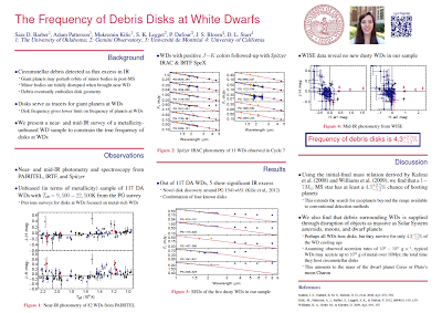
Neil Withers spotted this poster on Reddit:

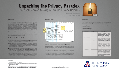
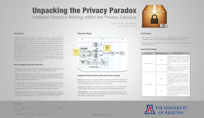
One of my friends entrusted my group and I to print his poster for a conference...he chose poorly.

You can click to enlarge...


I’m going to go out on a limb here. While this was meant as a joke...

I actually think it’s kind of effective.

Remember what the point of a poster is? It’s to give people something to talk about. And this poster does that, make no mistake. If I saw this poster, I would walk up to it and start a conversation.

The trick, though, is to make people go away remembering the science and not the joke. That wouldn’t be easy, because the joke is so good. But if you took away the joke, you might have far fewer chances to explain the science. On your next poster, maybe you can loosen up and have a little fun.

Related posts

Conversation piece

Hat tip to Biochem Belle.

Additional, 17 October
: Sciencegurl noticed this in her department.

Usable space

$
0
0

I like using all the space available to me on my posters. Big posters are easy to read and can get more attention.

At a recent conference, the organizers told the presenters that the poster boards were 8 feet by 4 feet, or 92 inches by 48 inches. But 92 inch by 48 inch posters didn’t fit on the board. The organizers had measured the poster boards from edge to edge, outside of the metal frame. The frame took up about an inch of space on all four sides.

When making your poster, make it 2 inches shorter in both dimensions than what the organizers tell you the space is. That will give you a little wiggle room if the organizers have miscalculated the available space. From my experience, this happens frequently.

This is going too far, though:


It looks like you’re not even trying.

Related posts

Board numbers

An augmented reality poster

$
0
0
I’ve talked about various ways to make posters more interactive, from using QR codes to showing video. This is another step in making posters more dynamic: using augmented reality.

Jump to the 4 minute mark to see what Adem Bilican did with his poster:


ECCB12 poster awards ceremonyby abilican

Given this and the winning poster at this year’s Neuroethology congress, it seems that one of the ways to make a successful poster is to transcend the poster format. How can you give someone more than a piece of paper on a board?

External links

Poster prize at ECCB12 with my augmented reality poster
ECCB12 poster awards ceremony
ECCB 2012: Bioinformatics with a Swiss Flavour
ECCB12 poster prize for A Bilican

Hat tip to Guillaume Collet.

Link roundup for September 2012

New type

$
0
0
I am a sucker for sans serif type on posters. But sometimes, it seems that the choices are somewhat limited for Windows users.

For a long time, Arial was the default sans serif in Windows. Arial is okay, but suffers from overuse. (And purists know Helvetica is better.)

More recently, Calibri has taken the place as the default sans serif on Windows. Calibri is a well designed typeface, but is starting to suffer from the same “it looks like someone can’t be bothered to change the default font” that plagued Arial. It can look lazy.

For some time, Gill Sans has been my “go to” typeface for posters, because I think it holds up well when viewed from a distance, as on a poster. But Gill Sans is somewhat dated, and I wanted a more modern typeface.

Making my last two posters, I tried two new options.

First, there is Corbel.


For some reason, I had not paid attention to this font before, even though it has been on my computer for several years, and it now a standard type for Windows.

When I was laying out a poster recently, I had the text in Calibri, and was looking around for different options. I had the poster minimized so I could see the whole poster on the screen, and the text was just barely readable. When I switched to Corbel, the readability of the text immediately increased. Calibri is a rather compact typeface, and Corbel is wider, which helps when you’re reading text from a distance.

Second, we have Cabin.


This is a descendent of Gill Sans and its fellows, and has some of the same advantages in terms of it legibility from a distance. It has some advantages, however, such as being able to distinguish a 1 from a lowercase l more readily than in Gill Sans:


I do admit that there is something about the detail and character of Gill Sans that I still prefer, though, when seeing the two side by side.

As shown in the example above, Cabin is tight in the vertical, and can looks too dense when set with the default spacing. A little adjustment in the line spacing helps substantially. But remember that in general, poster text will be better if you increase the line spacing from 100% to 110% or more.

Dynamic posters preview

$
0
0
I wish I could go to this year’s Neuroscience meeting, but cannot, so I will miss the debut of “dynamic posters.” But a preview is available here, where we get a better idea of what this involves.

The size of a dynamic poster is 4 feet, 4 inches wide, which compares quite favourably to the paper poster size of 5 feet, 8 inches. The downside, as I see it, is that it is being controlled by a laptop, which has got to be a substantial cost and annoyance. To make this attractive, I think there will have to be a move towards a more iPad like experience, where you simply upload the poster, and can navigate with a touchscreen.

Related posts

As was foretold by prophecy
Poster session 2032

External links

Dynamic posters

Worst of the worst?

$
0
0
Worst venue?

Overheard at a conference over summer: a poster session at another institution that decided to hold a poster session outdoors. in the height of August.

Apart from uncomfortable heat, unpredictable weather, wind catching posters... What could possibly go wrong?

Worst poster?

On Twitter, RuthFT shared“the worst conference poster I have ever seen.” It graced(?) the halls of the International Symposium on Archaeometry.


In fairness, Ruth noted:

It is very hard to do a poster for a heavily interpretive subject. Always too much text, but how else to explain/justify interpretations?

True. But even this could be improved by:

  • Putting the title in the upper left corner instead of the upper right.
  • Separating the rows to indicate that you were supposed to read across instead of down.
  • Better still, making the reading order go up and down instead of across, with space between each set of columns.
  • More careful proofreading to fix things like “objetives” instead of “objectives” in headings.
  • Keeping the type consistent; in particular not switching to italics in the Results section. 

Several of those changes only required paying some attention when hanging the poster. I almost wonder:


American Physiological Society poster course

$
0
0
The American Physiological Society has decided to provide a course on poster-making. I’m pleased to see at least one scientific society taking a more active interest in poster presentations! The text below is pulled from this PDF. I’m tempted to take it myself to see what there is to learn, and how other people do things.


2012 Professional Skills Training Course: Creating a Poster for a Scientific Meeting Online Course

Does Your Poster Have All of the Necessary Pieces?

How is the course structured?

  • 7‐day online course (November 15‐21)
  • All exercises and course materials are accessible 24/7
  • Discussion boards will allow you to interact with top faculty and peers
  • Course will be taught in written English

What is my commitment?

  • Dedicate approximately 1 hour a day to the online course
  • Complete all lessons on time and participate in all aspects of the course
  • Thoughtfully complete all the evaluations before, during, and after the course

What is the cost?

  • APS Member Price ‐$90 (you must be a member at the time of registration to qualify for this price)
  • Non‐Member Price ‐$180

What hardware or software do I need to have?

  • Computer with internet access (preferably high‐speed internet)
  • Software:
    • Browser: Internet Explorer or Mozilla Firefox ‐recent version
    • Microsoft Word
    • Adobe PDF reader (free download)
    • Macromedia Flash Player 6.079 or later (free download)


Register Online 1‐31 October2012.
Go to http://bit.ly/SJ8gNT, select the “Creating a Poster for a Scientific Meeting” link and register.

Hat tip to Janet Stemwedel.

The Better Posters workshop

$
0
0
Although I’ve been doing this blog for a few years now, I had never given a presentation or workshop trying to distill some of the best tips and ideas until this week. I gave two workshops at my institution in preparation for an undergraduate research conference to be held next month. Thanks to Danika Brown for livetweeting.

I’m hoping these will not be the last time I give this presentation. Have slides, will travel!

Link roundup for October 2012

$
0
0
Neuroscience

It’s the month of Neuroscience, the biggest collection of conference posters maybe anywhere. Lots of people offered advice for presenting posters at that conference, which has the advantage of applying to almost any other conference you might attend.

Neuropolarbear gives advice on presenting a poster: be able to do it in less than 5 minutes.

Don’t even practice a longer version. If people want more detail, they will ask about the parts they care about. That’s the brilliance of a poster, as opposed to a talk.

Drugmonkey has a follow-up.

Ask the person to tell you why they are there! Really, this is a several second exchange that can save a lot of time.

The Cellular Scale has more suggestions:

They say you only need to be there during the one hour that you are scheduled, but it's a good idea to be there basically the whole time.

And when you’re at your poster, In Baby Attach Mode reminds us to introduce people we know to each other.

(I)t’s a small gesture to introduce people to each other, but that it makes a huge difference in how you make people feel.

Scicurious covers a poster presentation experiment (that I’ve featured here on this blog, but worth revisiting). Next,  In Baby Attach Mode ponders dress sense at posters. Virginia Hughes also picks up the cause on Twitter. Finally, to round out the trilogy, here's a full-length post on conference clothing.

The Cellular Scale finds another candidate for worst poster ever at Neuroscience.

No graphs only words, well one picture of a whole brain, and TABLES! oh the tables that should have been graphs! But it wasn't just the layout, the presentation was rambly and confusing.

Katie wondered how many figures should be on a poster, and provided some field data from the Neuroscience conference floor:

(I) saw everywhere from 6-40+ in my row of posters.

My response: As many as you need to tell the story. Just remember that posters are good for short stories, not epic novels.

Drugmonkey on how to turn people away from your poster:

Title items that cause me to skip your poster “mechanism of”.

Similarly, Dr. Leigh asks:

Why do people title their poster/talks “evidence for [phenomenon]”? Why not just say what the phenom is, we assume you’re presenting evidence.

Bradley Voytek wanted this:

Someone should start a DejectedPosterFace tumblr for that look students have when they're standing at their poster all alone. So sad!

Your wish is my command, sahib.

Jason Snyder finds people who seem to be all postered out.

And I love this picture from Shelly Fan on a plane going out from New Orleans after Neuroscience.


And do not make jokes about their resemblance to any sort of weapon!

Shelly Fan made her own poster tube strap.

Even after it was all over, some people just couldn’t stop presenting! This was spotted in the New Orleans airport at 7 am the day after Neuroscience closed:


If someone does this next year, it will become tradition.

NeuroPolarBear has a round up with great tips for organizers.

One of the things I most wanted to see was the debut of “dynamic posters” at Neuroscience. So far, I’ve only found one comment about them:

But what really caught my attention at SfN 2012 is that Voytek and Warp were presenting “The Adventures of Ned the Neuron” and its development via a “dynamic” poster. That means they presented their story and concept on a large digital flat-screen rather than on the traditional posterboard in the conference center. No thumbtacks needed.

Warp tells me that SfN contacted her and Voytek to tell them they’d been selected as part of a pilot program prior to the meeting. Apparently, there was one dynamic poster presented during each poster session over the course of the conference. Presumably, if the feedback is good, we’ll see more neuroscientists presenting their colorful, three-dimensional data on flat-screens in the future. Say goodbye to those poster tubes and trying to cram them into the overhead bin on the airplane, kids.

Society for Vertebrate Paleontology

Neuroscience was not the only conference this month. We also had the Society for Vertebrate Paleontology. And I have to say that it’s a paleontologist, Tony Martin, who gave me the biggest smile this month in poster-related news with... Paleontologist Barbie.


This is one of my favourite things about posters: you can do things that you cannot get away with in a paper.

Meanwhile, Bora Zivcovic offers a great approach to reading posters, and a reminder about why you want to make a good one (my emphasis):

I think, in any field, the most interesting work is done by junior researchers and students, and what they say (and the enthusiasm by which they say it) may be more revealing about the future of a field. Which is why I focused on the posters. ...

I went to see the posters every day during lunch break when the posters are already up, but people are not there yet. I checked out every single poster, in order to get a feel for the field as a whole. Then I would focus on, and completely read, 4-5 posters each day. In the afternoon, when the poster sessions starts, I homed in on those 4-5 posters and talked to the authors, asked more questions. A number of those posters will end up here on our site, written by authors on the Guest Blog, over the next several weeks and months.

General

Finally, a bit of a “how to” article about making inforgraphics look good without compromising the integrity of the information.

Care to sit down?

$
0
0
At big conferences, you can be on your feet all day. There’s a lot of walking from room to room, and poster sessions are generally several hours long. Even the healthiest and heartiest can start to flag a little under those conditions.

Not everyone is in the best of health when a conference happens. (Some time, I’ll tell you about the experience of the student who started to suffer from food poisoning while we were on the plane to a conference.)

Organizers, you might consider having a few light, easily moved chairs for people at your poster sessions. NeuroPolarBear twigged to this at Neuroscience, with one of his recommendations:

More chairs throughout the convention center, including the poster floor, but also the hallways. When you see people sitting on the ground all over the place, it's a sign that there's something missing. That thing is chairs.

But at least don’t do this:

ESA wouldn't give her a chair for her poster session this year (really, wtf)

Yes, having chairs in the poster hall does require enough space and a little planning. But some of your attendees will thank you for it.

Hang time

$
0
0
This is a guest post from reader Mark Gurwell, used with his permission.

Are there some general guidelines that one should consider depending on the length of time a poster will be hung?

I ask this question from my experiences of the differences between the conference I most recently attended, the Division for Planetary Science (DPS) annual meeting, and something like an American Geophysical Union (AGU), or American Astronomical Society (AAS) meetings. At smaller meetings (DPS was around 800 attendees this year) you might have longer poster hang times, compared to larger meetings of a few to 10,000 or more, where the sheer volume of presentations necessitates frequent turnover.

For example, at the DPS meeting, posters were given ample time. They could be hung for the entire week, and each poster was in a topical group. Each topical group had a specific afternoon where they were “showcased,” which included a walk-through by all interested attendees where you could present your poster to a semi-captive audience (though the official limit on this presentation was 2 minutes).

At AGU and AAS, posters can be limited to as short as half a day before they must be removed for the next round of posters.

I think most conference attendees prefer the former model, since it means they can see all the posters of interest, even if they can't attend every day of a meeting. But both versions exist (and probably every shade in between), and each presents different challenges and advantages.

For the “all the time” extreme, you might expect more walk-ups and general interest, but it can be spread out over the week. You can’t possibly be by your poster all week, so your poster should to be standalone. It needs to be fully self-contained and must anticipate questions that might be asked if you were there. Some (I’ll probably count myself in this category) tend to compensate by making wordier posters. This may or may not be a winning strategy, and clearly still needs to be coupled with thought into title, colours, graphics, illustrations, and overall getting to the point in the clearest cleanest way.

For the other extreme, say a three hour block when your poster is put up, seen, and then taken back down, you probably need to be by your poster the full time. This allows your poster to become less self-contained and maybe more enticing. The goal here may be more to grab attention and (maybe not even necessarily!) drive home the conclusion, and then you the presenter can fill in the details conversationally. Thus, possibly less words, more graphics.

The downside here is that, with so short a time, it may well be that the only people you get to your poster are those you’ve already primed to physically seek your poster out, by your title and abstract published in the abstract book or online prior to the meeting. The chance of running across a really interested person is lowered, because everyone is frantically trying to get to the ten to twenty posters that they really want to see (or think they want to see).

I’d be interested in hearing about other considerations/techniques for posters that have either long or short hang times.

Related posts

Containment

Photo by MRHSfan on Flickr; used under a Creative Commons license.

Lessons from Tumblr

$
0
0
If you look around social media, particularly Tumblr and Facebook, you’ll see a lot of things like this:


This example is from We are the 99 percent Tumblr, which was created as part of the Occupy movement. And it was powerful.


Spotted at I Fucking Love Science group on Facebook. Which reminds me of this memorable rant about the popular group:

What you actually “love” is photography, not science.

I could make the case that there is no reason for these to be pictures. The point is all in the text. If all that mattered was pure efficiency, maximizing signal to noise ratio, people would paste plain ASCII text into their websites instead of these pictures.

But the success of these shows how much we love pictures of actual things.

Following a lot of fake pictures purporting to be Hurricane Sandy, Alexis Madrigal at The Atlanticwrote:

The algorithms at Facebook privilege photographs because they are what people are most likely to interact with. And users love a picture that’s worth a thousand words, four thousand Facebook likes, 900 retweets, a bunch of hearts, and some reblogs: everyone likes being an important node. The whole system tilts towards the consumption of visual content, of pictures and infographics and image macros.

This is a reminder of the power of images. They have more drawing power than text. If you want people to look at your poster, use pictures. Even a picture of text (like the 99 percent Tumblr) is more interesting than text alove.

External links

Image macro

Link roundup for November 2012

Giving posters to schools

$
0
0
One of the issues with conference posters is that they are usually one-shot deals.

You design the poster. You print the poster. You have the poster up for a few hours or days at the conference. And... then what?

Why not donate them to schools?

Science Café in Little Rock gives conference posters from the local universities to high school classes.

I like this idea. Academics in universities often forget how much we have in terms of information and resources. I also like the notion that students can see the kinds of projects that are going on by local scientists. This would even be more powerful is the poster shows research by undergraduate students, so that high school students can see that making real research contributions need not be in the far future, a decade or more away, but something that is right around the corner.

Hat tip to Will Slaton. Photo by Argonne National Laboratory on Flickr; used under a Creative Commons license.

Critique: Debris discs

$
0
0
Today’s poster is from Sara Barber from the University of Oklahoma, and is used with her permission. Click the image below to enlarge it!


This is a clean design, so the comments are fairly subtle.

Having the headings right aligned is... unusual. This is the sort of thing I generally don’t recommend, purely because it violates our normal reading conventions. The red lines do help distinguish the sections, though, so this is not a fatal problem.

In the author list, I recommended scaling the size of the superscripts down a bit. They currently seem to be the same size as the name they’re next to, and they’re a little distracting. Author names are more important than superscripts, so should be bigger.

I suggested putting a little more space between the bullets and the first letter of the following text. It’s a little tight in there in this version. For the second level of bullets, the bullets look a little dainty next to the text, and might be increased in size a smidgen.

The “Frequency of debris disks” box needed a little typographic massaging. The plus and minus numbers are a little larger, and a little closer, than comfortable. I was not a fan of the box around that, either. The size and the red colour alone is highlight enough. This would be particularly true if the “Figure” captions were in plain old black; then the red alone would be enough for the “Frequency” text to say, “I’m important!”

After reading my recommendations, she was kind enough to send back this revised version:


Again, the differences are subtle. When you can see one poster right after the other, or one superimposed on the other, each change does help make the poster look better.

The animated below GIF below, which superimposes the before and after posters, loops three times, then stops. If you see no movement, reload the image or the page,


Critique: Infrared

$
0
0
Today’s poster was submitted by Jessica Moore, who is manager of Center of Excellence in Nanomedicine at the University of California, San Diego.


There is way too much stuff going on around the title. You have a text based logo, a lot of names, and headings in boxes, and the title isn't that much bigger than those to "pop". People won't be able to pick out the title at a glans and walk by.

I do appreciate that there are lots of graphics here, but my first impression was that they are complicated and intimidating graphics. This is the first poster I've seen for the blog where I've thought, "This almost feels as intimidating as a bunch of long paragraphs of text." Part of that may be my unfamiliarity with the material, I admit.

The reading flow is understandable, but again, still fairly complicated. You have a lot of "bits and pieces" that makes it unclear of the order you need to look at things.

With a quick look, I can’t figure out either the question or the take home message.

Link roundup for December 2012

$
0
0
Wired has a collection of the best scientific figures of the year, in their estimation. I think the authors may be more impressed by the volume of information in these figures than by their design.

I want to know more about this project. It’s a new typeface, designed with people who have learning disabilities in mind. It’s called FS Me. I’d love to know how the choices they made were intended to increase readability.


Business cards are helpful ways to turn meetings in front of posters into contacts and netwokring. Victoria LaBalme talks about the importance of making your business card unique.


The big news in logos was the redesign of the University of California logo. Honestly, I liked the redesign. But many people did not. Regardless, however, I appreciate this post from Armin Vit (hat tip to Ellen Lupton), to which I add emphasis:

A logo, actually, is nothing. It’s useless. It derives meaning from what it represents. I’ve said this before: The Nike swoosh logo is shit. It’s a clunky checkmark. People think it’s great but it’s not. It’s the amazing athletes and their stories that Nike has associated with over the decades. It’s the quality products. It’s the great ads. It’s not the logo. If all these UC students think that this logo defines them then they have no self-worth. Their actions and their words define the logo. And, right now, what these people are saying and doing, reflects that UC is a bunch of cry-babies. Shut up. Let professionals do their work.

This battle was lost.

What figures look like to colour blind people. Here’s my post on this matter.

And, on a lighter note, the Comic Sans Project.

Critique: Privacy

$
0
0
Today’s contribution comes from Dave Wilson at the University of Arizona, and is used with his permission. It was presented at the International Conference on Information Systems in Orlando as a “research in progress” poster. This meeting has a quite good set of tips on presentation.

You can click to enlarge:


I love a lot about this poster. It’s got a sleek style, with a bit of an Apple aesthetic mixed with Colin Purrington’s style in this poster. Whether deliberately or no, it follows his recommendation of putting all the fine print in a band at the bottom

My main concern here is the choice of the grey steel background. Even in good light, on my computer screen, the contrast between the text (set in a beautiful, but thin, font) and the background is making this a bit difficult to read. This poster also has a substantial amount of text. Even light, well set blocks of text, as on this poster, tend to look grey from a distance, making this even darker.

I believe this conference was held in a Marriott hotel. Hotels often have dim lighting in their ballrooms where posters are set up. Regardless, any venue with low lighting will turn the text to mud, and make it hard to read. A lighter shade of grey would give a higher margin of safety for low light conditions.
 The use of a white background on the bottom also highlights the band at the bottom, though, which  contains the “fine print.” The metallic grey that covers most of the poster text above could have been brought down to cover the text below.

As a quick and dirty example of what I have in mind, here’s a revision done with a little mucking about in Corel Photo-Paint.


While I like some of what happens with that change, the downside is that the central figure does become less prominent. In the original, the grey background does mean the central figure pops out at you immediately. The handwritten look for the figure is appearing, and makes an attractive entry point for the passers-by. In the revision, the diagram doesn’t stand out anywhere near as much.
That might be helped by a little shadowing around the figure.

Poster making, like life, is often about trade-offs. If you want to make people notice that central figure, and you are there to present the poster most of the time, you might want the original version of the poster. If you were not there to present your poster, and more of the story is in the text that people will have to read, the revision might be more appealing.

Review: Writing in the Biological Sciences

$
0
0
I was sent a copy of Angelika Hoffmann’s new book, Writing in the Biological Sciences, by the publisher, unbidden. It’s been long enough that I initially forgot I wrote almost the same thing a couple of years ago, almost to the day, when I got a book called Scientific Writing and Communication, by the same author. I reviewed that here.

I had forgotten the previous book when I first opened this one. So, as I often do, I looked for a whether there was chapter on posters – there was. I got about four lines in before I started arguing with the author in my head. And looking back at my review of the previous book, it’s the same point: putting abstracts on posters. And I don’t understand why she says that posters don’t have Discussion sections....

Based on the poster chapter, and the comparative thicknesses of the two books, Writing in the Biological Sciences seems to be a cut down and slightly revised version of Scientific Writing and Communication. The poster chapter is short, just 12 pages out of a 290 page book, which is shorter than the 16 devoted to posters in Scientific Writing and Communication. The artwork is black and white, and a few of the graphics have changed. The sample layout is not the same one I showed in my earlier review.

There is a “Useful resources” section with four links, with horrible long URLs, that were checked in... October 2011. Given that when I reviewed the previous book, many of the links were dead, II After over a year of lead time, guess what? The first link is to Colin Purrington’s now-dead site at Swathmore College (but a new version is here). I’ve typed the links to the other three so you don’t have to:

Everything in my review of Scientific Writing and Communication, I will stand by for Writing in the Biological Sciences. There have been some changes, but no substantial improvements.

Reference

Hofmann, AH. 2013. Writing in the Biological Sciences. Oxford: Oxford University Press. 290 pages.

Related posts

Review: Scientific Writing and Communication
Review: A Short Guide to Writing About Biology (Seventh Edition)
Review: Scientist’s Guide to Poster Presentations

External links

Book website

Companion site to book (not active as of 8 January 2013)
Viewing all 644 articles
Browse latest View live


Latest Images