Quantcast
Channel: Better Posters
Viewing all 644 articles
Browse latest View live

Lessons from lingerie

$
0
0
I have said before that inspiration and design can come from anywhere. Today, I think I am really putting that claim to the test. I want to make the case that there are lessons to be learned about conference posters... from looking at bras.

There’s a phrase in this bra commercial* that you can apply to conference posters:


“Lift... and separate.”

Lesson 1: Lift. A good bra does not allow things to droop. Keep your key information – the question you’re investigating, your critical results, or your take-home message – just underneath your title. If possible, avoid sticking them down at the bottom of the poster.

Here’s another (sort of) bra-related way to remember this advice:


“My eyes are up here.” Remember where people’s eyes are, and you will have a much better chance of getting people to look at the right stuff on your poster, and of having a good interaction with them. Put your important information at eye level. If you’re pointlessely tall or of compact stature, put your information where most people’s eye are.

Lesson 2: Separate. A good bra makes it clear that a woman has two breasts. A good bra is structured to create space between them, avoiding smooshing, squishing, and the dreaded “uniboob” look. (Well, normally dreaded...)


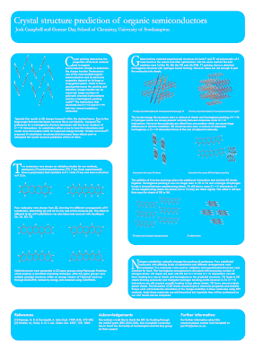
Conference posters commit the uniboob mistake all the time. Here is an example that was sent to me recently from Adam Wolfe (click to enlarge):


Adam wrote:

I have already removed one logo (a duplicated “old well” logo with different text for the hospital underneath). I am also going against the grain of a standardize template we usually use in hopes of showcasing some new “standard” designs.

This file showed me the bottom right corner when it opened, and I my very first thought was, “Oooh, that’s a lot of reading.” If it were my poster, I would be trying to shorten the text, and convert it to regular paragraphs instead of so many bullet points.

There’s much to like here. The headers work well at pulling apart the different sections. The colour scheme is consistent and attractive.

When I looked a bit longer, I found the uniboob moments, where there wasn’t enough separation between elements (highlighted in orange):


I first noticed in in Figure 3, which drove me bonkers. Text should not overlap lines. The other examples are not as bad, but “not overlapping” is too lax a standard for separating items on a page.

Margins and white spaces are undervalued. To show this, let’s me ask you for a quick, “off the top of your head” estimate:  

How much of a typical piece of paper is white space?

A standard 8½ × 11" piece of paper (or 93.5 square inches) usually has a one inch margin. That means the space you’re putting your words on is confined to an area of 6½ × 9" (or 58.5 square inches).

The white space from margins alone is taking up about 37% of the page. And we’re not even considering spaces between lines or spaces between words. I’d be willing to guess that most people would probably name a number about half that amount if they were trying to figure out how much white space should be on a poster.

In my revision, I follow the “bra rule,” and separated text with white space. I moved some of the text in the figures away from the edges. Adam’s poster isn’t heavy handed in its use of boxes or the data prison, but I still ended up removing a lot of lines and just using white space, particularly in the tables.

I also removed the “±” sign between the mean and standard deviation from Table 1, following the advice of Curran-Everett and Benos (2004). You can’t have a negative standard deviation, so “±” is “superfluous.”

I also changed much of the text to sentence casing rather than headline casing.

The final result is only subtly different. A major redo would tackle the amount of text on the page, but you can get a lot of improvement in the overall look just by tackling the details.


The details are often things that always end up making the difference between an okay looking poster and a smart one. Just like in a bra.


Lesson 3: Detailing. Most bras are very similar, when you come down to it: cups, straps, and snaps. Sure, strictly speaking, you don’t need that little rosebud here, that extra bit of lace there... but what a difference it can make to the overall impression it leaves.  It’s the details that make the difference between boring and daring.

Related posts

Poster real estate
The data prison

Reference

Curran-Everett D, Benos DJ. 2004. Guidelines for reporting statistics in journals published by the American Physiological Society. American Journal of Physiology - Gastrointestinal and Liver Physiology287: G307-G309, doi: 10.1152/ajpgi.00229.2004

Pictures from here; here; here; here; here.

* Including this commercial is in no way an endorsement; other bras are available.

Link roundup for May 2013

$
0
0
SpotON

A bit of old news that came out just after last month’s link roundup. Better Posters was one of the social media case studies at SpotOn (short for Science Policy, Outreach and Tools Online). If I may, I liked how this turn of phrase came out when I was asked for advice on tips:

Find a problem and help people fix it. The Internet produces criticism as easily as most of us produce carbon dioxide and heat – it’s so much part of you, you don’t even realize that you’re doing it most of the time. Creating a resource that people can use, and offering to help, stands out from the crowd.

Logos

Design lessons from game logos. One of the mantras of this blog is “Design is all about decisions.” With that in mind, look at the number of explicit, conscious decisions that were made as you read through this.

Here’s a look at the creation of another logo, this time from Duarte Design. I’ll call out two notes from the article:

  1. Never underestimate the power of music in the creative process.
  2. Always take a moment to step away from intense ideation and give your mind a break from the assignment at hand.

And, here’s a third logo design, this one from Alex Jay. This one was done a while ago, so it was done with paper, pencil, and rulers!

I’ve saved the most familiar logo for last. If you’re a Star Wars fan, you need to read this amazing retrospective of the design of the film’s iconic title. Alex Jay again.

Typefaces

Seth Godin reminds us that sometimes, you should just make simple choices in your type, and embrace the power of pastiche:

(D)on’t call attention to your typeface choices unless you want the typeface to speak for you. Instead, start with the look and feel of the industry leaders and go from there. ...

It’s a bit like wearing a dark blue suit to a meeting with a banker. You can wear something else, sure, but make sure you want it to be noticed, because it will be.

Or, to put it another way... here’s today’s Comic Sans bon mot from David Shiffman:

If you give a conference presentation using Comic Sans font, that's what 100% of the twitter discussion of your talk will be about.

Seth’s piece also reminds us of this xkcd comic:


Garamond will save you ink. (Hat tip to Biochem Belle.)

Would you like to know what that cool typeface is? Type identification is a tricky and subtle art that requires a lot of knowledge. MyFonts provides a tool that might get you part of the way home. (Hat tip to Stacy Baker and Holly Bik.)

Lawsuits

Colin Purrington updates us on the bizarre plagiarism charge for his old poster website.

Fame and glory

Readers of this blog are, I hope, people who care about doing good job on data and graphics and visualization. I would love it of one of my readers were to make a splash in the International Science & Engineering Visualization Challenge, co-sponsored by the National Science Foundation and Science magazine. The rules and entry forms and all that good stuff are here.

The Symbiartic blog has announcements for two scientific illustration conferences this summer. Cool! Now there are two meetings where I’d love to walk through the poster sessions!

Critique and makeover: Peruvian medicine

$
0
0
Today’s contribution comes from Kenzo Koike at USF Health Morsani College of Medicine in Florida, and is used with his permission. Click to get the bigger view:


The first things that jumped out at me were:

  1. With three very different logos in the title, it’s impossible for that title to be centered gracefully.
  2. There are myriad things that are not aligned, which is common in PowerPoint posters.
  3. The “peek-a-boo” light blue boxes against the dark blue background are a classic example of boxology.

The first revamp addresses these, while hopefully keeping the style intact. I moved the title to the left and the logos to the right. I eliminated the dark blue and made the light blue even lighter. I started working on the alignment issues.


Evening out spaces and lining things up was a sizable project, and I could probably spend hours fiddling even with the revised version below. But the version below is where I stopped and sent it back to Kenzo.


I moving the single reference from the bottom to directly underneath the table. This means a reader no longer has to go hunting for the reference, because it’s now at the point of need. It also creates a text element under the table, so it parallels all the other images around it, allowing more things to be lined up.

Consequently, this allowed the bottom box to become narrower. The top box was made narrower, too, by moving the purpose statement to the right of the word “Purpose” instead of underneath it. This also let me make the “Purpose” statement bigger, more fitting its importance.

That both the wide boxes got skinnier also let me make the title bigger again. The title should always be the biggest, clearest text element on a poster. In the first version, it’s fighting too much with the dark blue background and the logos.

There are still some design elements of this poster that I dislike, and would normally recommend against. The wide boxes spanning the length of the entire poster at the top and bottom will be something of a nightmare to a reader. The different image sizes of the SIS sign photo and the blog screen capture frustrate me to no end, because there will just be no good solution to make those align as they should.

As always, the goal here is improvement, not perfection.

Related posts

Boxism

More lessons from lingerie: details versus decoration

$
0
0
A few weeks back, I wrote a post about bras. And I ended with a lesson that I thought could use a little more clarification.


Here we have a fairly utilitarian bra. It has everything needed, but no more. It does its job, and but clocks in at 9:00 am and clocks out at 5:00 pm precisely. It does what is needed of it and no more.

Here is a poster equivalent, spotted on my campus recently:


Like the bra above, about the only thing you can say in its favour is that leaving the space uncovered might be more embarrassing. At least it’s covered.


Here we have the sort of bra that is close to what I was talking about. This is a bra that puts in a little extra effort. Someone has made some decisions about fabrics, colours, scalloped edges. It is pretty. And it’s pretty because someone thought about the details. As I wrote a few weeks back:

Lesson 3: Detailing. Most bras are very similar, when you come down to it: cups, straps, and snaps. Sure, strictly speaking, you don’t need that little rosebud here, that extra bit of lace there... but what a difference it can make to the overall impression it leaves. It’s the details that make the difference between boring and daring.

On a poster, the details can be things like the choice of typeface, paying attention to aligning text on the page, picking complementary colours. Most of the posters I show on the blog are at least trying to make an effort in this direction.

But don’t confuse detailing with decorating.


This bra is covered in diamonds. It is something that nobody can use in day to day life. The cost of diamonds make it completely impractical for anyone to wear outside of a runway costume. You can’t afford the insurance to wear it.

Then there’s that big dangling thing in the middle, which seems like it would catch on any clothing worn over top. Bras are generally undergarments, after all.

That’s not detailing. That’s decorating. It is overkill. It is pursuing the aesthetic so hard that it stops being something that anyone can use.

The equivalent on conference posters are things like 3-D effects in graphs and gaudy colours:


Photographic backgrounds  and an overabundance of typefaces:


Sure, you might think it looks attractive in theory, but when you actually get it out into the field, it’s like you suddenly have a big dangly diamond thing under your cleavage that is catching on your shirt. It won’t actually work in real world conditions.

And here we have decoration...


...that is just very odd.

Related posts

Lessons from lingerie
Communicate, don’t decorate

Critique and makeover: Corn proteins

$
0
0
I’m always grateful to contributors like Madelaine Bartlett from Brigham Young University, who kindly submitted this poster and allowed it to be shown on the blog. Click to enlarge:


This is a nice use of a grid, with all the columns and rows clearly defined. The colours are well chosen, and the fine print is unobtrusive at the bottom.

However, in her email, Madelaine made note of my “attitude towards boxes.” Indeed! Away with them, I say! I banish thee! Let the white space do the work!


In this case, the elements do feel a little tight even after removing the boxes. We can make space by removing the summary under the title. It is difficult to read not only because of the small text, but because the line length stretches almost four feet across. Abstracts on a poster are redundant in any case.

I also shrank the each element by about 95% so that I could make the spaces between the columns wider. This made it clear that these are meant to be read down, and not across.


The section headings in the top row were all coming too near the figures immediately underneath them, so I spaced those out a little more.

Finally, I tried aligning the text to the top of the picture in the “Functional studies in progress.” I’m not sure it’s better, but it’s worth trying such things.

Normally, I would increase the size of the text in the “Functional studies in progress” and “Conclusions” section. Changing text size without changing column width is hard to do with the file I had, though. Larger text for “Conclusions” would be appropriate, since it is the take home message and thus important. The white space between the conclusions and acknowledgements is also a bit large, and making the concluding text come closer to it would provide a little more continuity.

The most improved graphic award

$
0
0
Making the rounds on Twitter today is this figure from a cancer research paper manuscript (archived in PubMed):


That someone would consider this fit for either submission or archiving is surprising.

And here’s the final version:


How the originals got archived is not clear. Apparently, this should not have happened.

This is a good example of the power of good graphics.

Link roundup for June 2013

$
0
0
The British Science Association has published Poster Design: A practical guide for scientists and engineers. Most of the ideas in there should be familiar to regular readers of this blog. (By the way, would making this available as a regular PDF kill you, guys?) Hat tip to Perrin Ireland for finding this.

The Finch and Pea blog makes a persuasive argument that artists should be invited to conferences. Check out the work of conference artist Regina Holliday:


The post says of her work:

Why should conferences invite artists? What do they bring to the table? I asked Regina Holliday,  who has been live-painting at health care conferences for three years. “I disrupt them,” says Holliday. “I give them a different worldview,” adding that her “very visual” take on the proceedings of large meetings can cut through the massive pileup of verbal information that most conferences provide.

I like what John McWade has to say about type:

This power of type is in your hands. It’s a big gun. But you must know it and control it. A few tips:

  1. Choose type for its voice, not your taste. Sometimes the two are the same, but not always.
  2. Don’t add meaningless stuff — outlines, bevels, shadows, flames. Look again at these examples. Their purity is their power.
  3. Space carefully and evenly. Letters are not naturally uniform; the spaces between them are as important as the letters.

Type is the most influential tool to which the designer has everyday access. It is also the most mishandled. Typography is not the same as typing. Typing is e-mail. Typography is architecture, structure, theater, motion, art, life. Type has a voice. Take it seriously.

The point of conferences is to create conversations. Alas, conversations can be difficult to start. Nature Jobs Blog has networking suggestions by Carolyn Beans. While billed as being for grad students, it’s good advice for anyone, really. Let me comment on her second tip:

2) Have an opening ready—Immediately launching into your elevator talk seems unnatural. Instead, open with a question or observation about a scientist’s work. Then he or she will inevitably ask what you study.

Here, remember the “social object” theory (which is why posters work): it’s easier for two people to talk about a third thing. Look for interesting objects or other people in the environment to comment on. That’s easier to start a conversation about than speaking about yourself or the other person.

The issue of how to dress when you’re a scientist. This causes many people much stress, so I like this at the end:

Thankfully, there’s more than one way to do it right.

I want to know where the poster session is in this visualization of conference attendee movement. Hat tip to Flowing Data.

The screen vs. the page

$
0
0
My university has an award-winning annual student magazine called Panorama. The new issue, excellent as always, contained a lesson in this two page spread:


What you see on the screen is not what you see on the page.

I bet this looked great on the computer screen. This is an ambitious layout. Outlining text around the women’s figures is tricky and well done here. And I bet you could see the face of the middle model  on the computer screen.

But the printed paper pages were bound together with glue to give the magazine a square spine. The pages don't lay flat, and there’s a gutter margin where you can’t see anything. And so we have a model who is all limbs.

This particular problem is not likely to arise on a poster, but the principle is the same. For posters, colours that look bright on your computer screen can look muddy in ink. Images that look fine at less than 100 pixels per inch on screen can look terrible when printed at 300 or 600 pixels per inch on paper.

What works in theory on the screen doesn’t always work in practice on the page. 

Posters should not be usable as drapes

$
0
0

Sometimes, we scientists are the world’s dumbest smart people.

Reader Ewan McNay spotted this at this year’s meeting of the American Diabetes Association. He wrote:

I think someone inverted length and width of the available posterboard...

Even if someone thought this was a vertical space, how did they think they would hang the poster?

Check the size of the available space. Then double check it. Then make your poster a few inches shorter in both directions in case the organizers chew up space with board numbers.

Critiqe and makeover: Quackenbush! (Because it’s fun to say)

$
0
0
Today’s poster from an upcoming Ecological Society of America meeting comes from lead author Caitlin McDonough MacKenzie and is shown with her permission. Click to enlarge:


Caitlin’s poster has a nice clean layout. However, one thing that you can see by drawing a couple of lines is that the grid is not very tight, particularly in the left column, where the image sticks out further than the text:


Let’s start cleaning up. Shadowed text? No reason for it. It obscures the letter shapes in the title, where readability from a distance is critical. Also pulled out the colons from the sub-headings, since nothing is following them.


The next change I made was starting to work on the data prison in the table. Lots of vertical and horizontal lines went bye-bye:


I then lined up the table, and tweaked the figure captions. For instance, I spelled “L” and “R” as “Left” and “Right.” Abbreviations almost always make extra work for the reader (exceptions for super common ones, like DNA, where the acronym is better known than the words). If you have space, spell things out!


The biggest change in the next version was to emphasize the message in the central and right columns’ sub-headings. I did that in three ways.
  • I made them bold, creating a cue that these sentences were important.
  • I changed them from questions to statements, making it easier to get the point right away when scanning.
  • I left aligned the text to make it more consistent with the paragraphs below, and to emphasize the grid.


The final changes were to adjust the spacing in the central column. I made the top two graphs a little larger, so their edges would be flush with the text below them. I also moved the QR code a bit to create a more comfortable space between it and the text. And a final adjustment to the figure legends, so that “Left” and “Right” start their own lines.


The final poster looks much like the first poster. All of these little changes together give it a cleaner, classier, more polished look. It’s all about the details.

Caitlin was happy with the end result:

Wow! Thank you so much! It’s amazing how much of a difference those little tweaks can make. I have a renewed appreciation for the power of design in communication.

Link roundup for July 2013

$
0
0
The NIH has been giving workshops on poster presentations. Here is the latest one from earlier this summer (embed link doesn’t allow graceful resizing to fit in blog column, alas).

That the presentation started with standard bullet point slides did not fill me with hope. And this is reflected in one of the pieces of advice that I am not sure I disagree with: “Use bullet points if at all possible.” I still prefer paragraphs.

The information within is generally quite good, however. Hat tip to Mike Pascoe for spotting these.

PVP illustrates rule 34 of the Internet, regarding type:


This post by Nina K. Simon isn’t about posters, but it is about conferences more generally. Organizers:try more workshops, hackathons, and the like.

It is amazing to actually DO things with colleagues in professional development situations instead of just talking. In 2009, after we hosted the Creativity and Collaboration retreat, I wrote a post about ditching "conferences" for "camp" experiences. Four years later, my appetite for these kinds of experiences hasn't changed. It felt great to once again be working with people--brainstorming exhibit challenges, editing label text, even just messing around on the player piano together.

External links

Creating and presenting a dynamic poster (2010): Event listing (with PDF of slides)
Creating and presenting dynamic posters (2013): Event listing

Detective stories: “Whodunnit?” versus “How’s he gonna prove it?”

$
0
0
Academics are curious people. They are driven by questions. They assume their fellow academics are also curious. Consequently, we often write things as though it’s a detective novel.

Everything start with questions. You see posters that have question in the title, questions in the introduction, questions leading off the results... and everything is revealed at the end.

It’s just like in a detective novel where all the clues are laid out, the suspects are gathered, then the big revelation: “The butler did it!”, so to speak.

I contend that it is much better to make statements than ask questions on a poster.

Always remember this: in poster sessions, there are always more posters than time to view them. And questions are more work for the reader than statements. I have to understand the question, then see the evidence, get to the answer, and check that the evidence and the answer line up. Now, these are good practices... but they are time consuming. Respect people’s time and tell them the bottom line right away.

This need not make for a disappointing story. If you go back to detective fiction, one famed detective series made it a point of revealing the killer at the start of every episode:


The question in Columbo was not “Whodunnit?” but “How’s he gonna prove it?” The fun in Columbo was in watching the cat and mouse dynamic between the detective and the murderer, and seeing the killer try to answer the infamous “Just one more thing” question that Columbo was always asking.

Update, 2 August 2013: Science Refinery agrees!

Critique and makeover: Prediciting pollinators project

$
0
0
Today’s poster is courtesy of Adriana De Palma. This poster is also available from predicts.org.uk. She notes, “At the bottom where it says ‘please pick up a flyer’, I obviously had flyers by the poster that could be taken!” You can click to enlarge.


Adriana is a regular reader of the blog, so not surprisingly, there a lot I like about this poster. There’s an attractive photo in the upper left to provide an entry point. The reading order is clear. The text is large and visible, and the colours on the graphs and bottom logos are cohesive.

Regular readers will also not be surprised to learn that my biggest concern is with the logo next to the title. First, the logo is so big that it is competing with the title for attention. Second, that the logo contains a word, in the same colour as the title, makes it a bit difficult to separate the two, causing a bit of visual confusion. My first attempt was to try flipping the position of the title and the logo, and make the logo a little smaller.


Then, I tried making the logo a light gray, so as to be a little less obtrusive and distinct from the title.


Regular readers will also know my anti-box prejudice, and shouldn’t be surprised that I tried removed the box around the material at the bottom.


The “Imperial College London” and “BBSRC” logos are uncomfortably close to touching. I shrank both of them to give them both a little more breathing room:


Finally, I went back to that top logo again. I still wasn’t happy with it. While I liked the title displayed more prominently on the left and the logo on the right, I decided to try an alternate version without the “Predicts” logo at the top at all:


Personally, I like this version with just the title. If I had the inclination to keep fiddling with it, I probably would have tried to move the “Predicts” logo down to the bottom, next to the QR code, but the amount of fiddling it would have taken to get it right deterred me from attempting it.

Thanks to Adriana for sharing!

Related posts

The epic logo post
Boxism

Put down your tablet and phone

$
0
0


I was listening to a webinar on poster presentations, when the host mentioned how it was a big turn off when a poster presenter was “playing Angry Birds when someone is walking by.”

Part of the secret to getting people to stop by your poster is to look willing to engage with people. You can’t do that if:

  • You’re looking at your phone or tablet for more than a few moments.
  • You’re sitting on the floor reading or eating.
  • You’re talking to someone else about something completely unrelated to your poster.

Now, there is a happy medium. You don’t want to appear disengaged, but desperation is not appealing, either. You don’t want to:

  • Stare at people as they walk bye with pleading puppy dog eyes.
  • Haul people off the conference floor.
  • Launch into detailed explanations of your poster when nobody asked for it.

External links

Poster presentations that rock

Picture by ftrc on Flickr; used under a Creative Commons license.

Mug shot

$
0
0
Should you put your picture on your poster?

I understand the theory. The theory is that by putting your picture on your poster, you make it easier for people to recognize and find you, particularly if the poster for quite a while before the actual poster presentation time. Plus, people are naturally drawn to looking at faces.

I’ve never done this, and I’ve never been a fan of the idea. It always seemed to me to be a little contrived and overly eager. I’m skeptical that a picture works better than a name tag. Posters always have author lists, and attendees have name tags. In my experience, it is rare that there is confusion about whose poster it is.

If you want someone to be able to recognize your face, it can't be the size of a postage stamp on the poster. It would have to be fairly big. Poster real estate is limited and valuable. I am very much in favour of maximizing the work.

Similarly, if you wanted a picture to serve as a way to recognize you, probably the best place to put it is at the top of the poster. Then, you run into a lot of the same layout problems that you have with logos.

If you have collaborators, do you put all the pictures? If not, how will people know which name the photo is associated with?

Finally, not everyone takes a great picture every single time.


Hat tip to the webinar on conference posters, where this question came up.

External links

Poster presentations that rock

Passport photo from here.


Link roundup for August 2013

$
0
0
Katie M. Everson has created The Scientist’s Guide to Poster Design. One resource there that you won’t find here is an tutorial for Adobe Indesign.

Also extremely good is this recorded webinar on poster design, modestly titled, “Poster Presentations that Rock!”

This month’s “run. don’t walk” link is to a compilation of Nature’s Points of View column. It is awesome. Hat tip to Biochem Belle for sending this my way. There are compiled columns about:

  • Composition and layout
  • Using color
  • Elements of a figure
  • Improving figure clarity
  • Multidimensional data
  • Data exploration

Here is a good set of conference-going tips from David Shiffman over at Southern Fried Science. Sarah Semmler has even more.

Meanwhile, Mark Rom calls conferences “lumbering dinosaurs”. It’s mainly a criticism of “panels” (what some conferences might call Ósymposia”) more than anything else. But poster sessions are mentioned:

Scholars Prefer Presentations, Not Posters

For conventional conferences, this is probably true. (It is, as I’ve documented a few times on this blog. - ZF.) To the extent this is true, it is probably due to the weight of tradition and the fact that authorities largely determine who gives papers and who gives posters (‘‘I’m sorry to inform you that your paper proposal was not accepted, but you may present at a poster session.’’) This perception is probably reinforced through cultural norms that give the signal that ‘‘real scholars’’ give panel presentations, while the posters are merely a sympathy prize for the less fortunate.

A summary of some of his points are at the College Guide blog.

This retrospective on how scientific papers have been typeset over the past 350 years is worth a peek for thinking about designing with text. Hat tip to Anna Sharman for this one.

Why do we need such big text on posters? Gary Foster nails it:

That's why all students are taught to use big fonts on posters. It's hard to read when tipsy ;-)

But big should not be the sole criteria for font choice (from What we should call grad school):


I Can Haz Cheeseburger is not to be outdone:


You might remember that I am a big fan of the TV show Samurai Jack. Fellow fans, rejoice! It’s coming back in comic form.

Critique: Protein binding

$
0
0
This week’s poster was originally shown at ISMB/ECCB by Stephen J. Bush, who was kind enough to give his permission to share it with you! Click to enlarge...


Without a doubt, the most eye-catching aspect of this design is that central circle, with a dig-eared rectangle overlain on the top, straddling the two columns. It’s just a couple of steps shy of drawing a bullseye in the middle of the poster. You can’t help but look at it. If anything on this poster warrants further consideration, it’s that figure.

The benefit of this circle / polygon combo is that it draws your eye in. The downside is that it is not clear where the image belongs in the overall narrative. Is it an example for the Introduction? Or maybe the Results? The corner of the polygon almost forms an arrow pointing down to the Results. This might be a cue for the reader, but it’s so subtle that it’s hard to tell if that was deliberate or not. The central circle could even be part of the Methods, although the position doesn’t suggest that as strongly as the other two.

The typesetting around the circle is good on the left side, but the the numbered list on the right of the circle creates a little tension between the curve of the circle and the right angle created by the list.

Everything else is crisp and there is not a lot to pick at. It might benefit from one more pass to see if there was anything else to cut, but the poster does not seem to have large amounts of fluff.

The moral of the story is: When you have an element of a poster so powerful that it dominates everything else, you need to make sure it is doing exactly what you want it to do.

Related posts

The eye loves the circle

The best picture will usually be the one you take yourself

$
0
0
“This is the best picture I was able to find on the Internet.”

There’s no sin in finding images on the Internet. I’m a big fan of Flickr and Google Images, too.

But I’ve seen people use crummy pictures from the Internet of scientific equipment that they use practically every day. And these are not difficult pieces of equipment to photograph because they are very large or very small. No, these are mundane objects that sit on a benchtop, like PCR machines.

I’ve seen people put up crummy pictures from the Internet of some other lab doing a procedure when it’s a procedure that they themselves do all the time.

You look witless and lazy when you say, “This is the best picture I could find on the Internet” if you could have taken a picture yourself.

High quality cameras are almost everywhere now. Even if you are one of the increasingly small number of people who does not have a smartphone, you probably know someone who does who would be happy to take the picture for you.

Crossposted from NeuroDojo.

Critique: Semiconductors

$
0
0
Today’s poster come from Josh Campbell, and is shared with his permission. Click to enlarge...

Portrait posters are always tricky, and this one has a nice clean two-column layout that leaves no confusion as to what you are to read in what order. Both Josh and I like how the dropped caps look in their boxes. Now, I am not a fan of boxes, but Josh did concede that I might have had a point about leaving off the logos.

I printed this on paper and tried the “arm’s length” test, which this poster passes, but only just by the skin of the teeth. The text is readable, but just barely. Bigger text would be very welcome here.

The text in the lower right box (beginning with “N”) comes too close to the edge of the box, particularly down in the lower left corner.

While we’re looking down at the bottom, another part of the poster that is a problem is inconsistent margins between the boxes. In particular, the bottom of the right column doesn’t line up with the bottom of the left column. Here’s a quick and dirty aligned version that doesn’t set off my alignment OCD as much:


Josh writes:

I needed a coloured background to show up my molecules so I tried to go for a neutral colour that also ties in with my university colours.

Unfortunately, the colour choice for the background is still a problem. The blue and the grey molecules are too close, and the molecules are getting lost at any sort of distance. The following quick and dirty colour replacement grates on the eye a bit:


I show this just to demonstrate that the pictures of molecular structure are much more readily visible against a lighter background. Those molecules are the whole point of the poster, and it would help if they were more visible than they are here.

Related posts

Is it big enough? The “arm’s length” test

Link roundup for September 2013

$
0
0
This animation shows how to improve graphs, with many of the same lessons I talk about here for posters. Hat tip to Mike Taylor and Anna Sharman. I like it, but it goes just a bit too far in pursuing minimalism. It starts here:


 Here’s where I would have stopped:


But the author goes on...


If you’re going to write numbers instead of having a Y axis, you might as well just have a bulleted list:

  • French fries 607
  • Potato chips: 542
  • Bacon: 533
  • Pizza: 296
  • Chili dog: 260

Do the bars start at zero? Is it a linear scale? Removing the Y-axis makes for too many possibilities for deceptive displays.

The animation above males an appearance in a good rant against infographics. Hat tip to Brian R. Pauw for this one.

90% of the infographics out there are baroque, non-selective compositions of facts.

Comic book letterer Todd Klein has created a “Compendium of calligraphic knowledge.” Beautiful, and with good lessons for conference posters, too! It’s a signed, 11 × 17" limited edition print of 300 copies. All for the price of $16 plus shipping. You can buy it here.


A Bit of Behavioural Ecology would like to remind you: Nobody cares about you. (Actually, they might, but they have a point about conference posters: nobody will be as engaged and fascinated with your work as you are.)

Tech In Translation has some musings on the differences between academic conferences and tech conferences.
Viewing all 644 articles
Browse latest View live


Latest Images