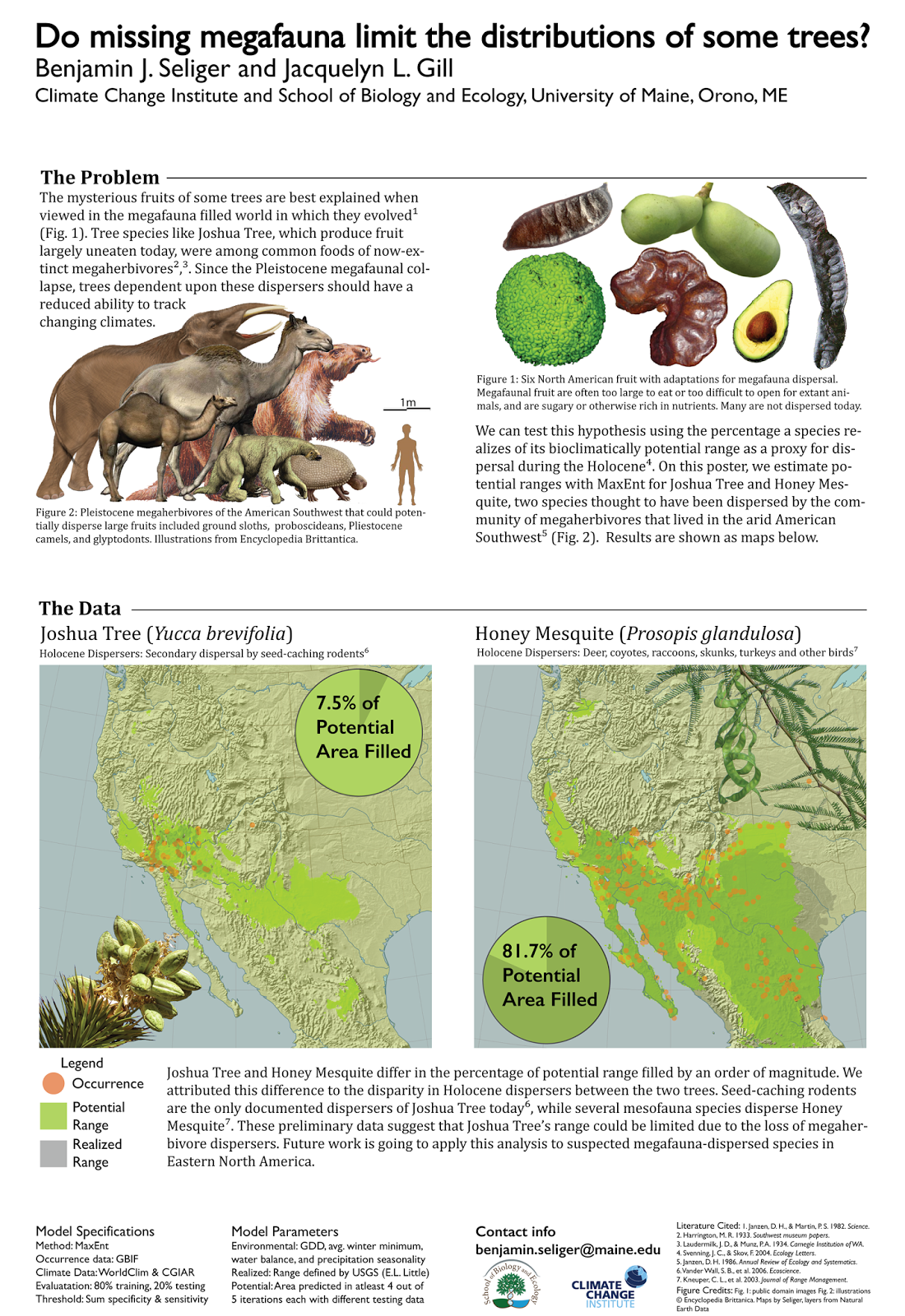
Quantcast
Channel: Better Posters
Viewing all 644 articles
Browse latest View live

Link roundup for May 2014

$
0
0
Here are some posters to help you learn about typography, like this one:


Biochem Belle peers into the future:

Looks for poster tubes boarding flight. How will we spot science conference goers when posters go fully digital?!

Remember, talking to people with poster tubes in the airport lobby is a great way to network!

And Jeremy Berg peers into the past:

Last time I made a poster myself, it involved much more rubber cement.

Katie delivers five great tips for how to mingle at conferences at her blog, Sickness is Fascinating.

Don't be afraid to mention random or only tangentially-related things if you're getting the vibe that these people you just met a few minutes ago would totally appreciate learning about the International Mustache Film Festival or seeing a picture of the awesome mullet you sported in kindergarten.

Can it be too simple? Plus, critique and revision: number processing

$
0
0

Andrea Quintero asked:

Can a poster be too boring/simple?

Before I answer, I want to distinguish that posters are about both form and content. In the context of this question, I think “simple” is mostly about the form of the poster – the layout and the graphic elements – not the content. Having too little content doesn’t make a poster “simple”: it makes it stupid.

If you read regularly, you’ve probably realized that I am a believer in simplicity. “Take out the trash” is often my first response to trying to make a poster better. Can a poster be too simple?

I was little surprised to realize that my answer is, “Yes.”

Posters are visual displays. So, a poster with no visual elements is too simple. Here’s something that doesn’t have much business being a poster:

A title and a bunch of paragraphs (even cleanly laid out ones) do not a poster make.

Here’s Andrea’s poster:


She noted that it was influenced in some ways by posters here on the blog. I think the dropped caps may have come from here, as I’ve used them occasionally, but haven’t seen too many other people use. On this poster, the dropped caps are causing problems. From a distance, they “pop” as random letters. This is one symptom of this poster’s need for a stronger sense of hierarchy.

The title, which should always be the most visible and important thing from a distance (it’s your highway sign) is getting lost. The “Attention Network Test,” “Enumeration,” and “Magnitude comparison” headings are popping out first.

Speaking of which, the words “Attention Network Test,” “Enumeration,” and “Magnitude comparison” are doing double duty here. They are both acting as headings, and they are part of a sentence. But the rest of the sentence is lined up at the top of the headings, which breaks our normal expectations.

Let me changethe sizeof the text in this sentence. See how everything lines up at the bottom of the letters along the baseline, not the top?

Anytime you want to use different size text in a sentence, it’s better to line up the bottom than top.

I suggested using slightly more subdued colours for the graphs, rather than the bright primary colours.

The central rows of data are not a bad idea, but they look crowded and busy. The text on the ends bracketing them also look dense.

Andrea wrote that the poster has most of my dissertation work, and that “It is all precious and important to me.” That can be a warning sign. Writers have a saying:

You have to kill your darlings.

That is, there is stuff you might love for some reason. But you often have to edit out stuff you love because it just doesn’t work in the larger context of the story you’re trying to tell, or the time constraints of the medium, or what have you. You have to be ruthless.

After our discussion on Twitter, Andrea went away and created this revision:


I think this is a much improved version. The dark colour band of the title gives it some visual weight, so it’s clearly signifying it as important without increasing the font size. The “popping” dropped caps are gone, and the colours in the graphs aren’t fighting with each other any more. I think the poster still needs a stronger hierachy in the text, but there’s no doubt in my mind that this revision is the better poster.

The poster went well, and Andrea wrote:
I got many compliments on my design. Thanks for the advice!

Critique: German chamomile

$
0
0
Today’s contribution comes from Reyna Gutierrez Rivera, and is used with permission. Click to enlarge!


On the plus side, the “Finding” box at top works well in providing a clear take-home message. The methods flow chart is also a good idea, although it could benefit from being smaller, because...

Everything is too close together! This poster needs wider margins between the columns, between the graphs, just everywhere. Making text smaller or cut some material will be worth it. The place where the poster needs the most clean-up is in the results. You kind of have two columns, but nothing lines up, so it looks disorganized. For instance, the figure and table legends don't line up with their data above them.

Given how much is crowded below, a lot of space can be freed up by putting the institutional address on one line. It's chewing up a lot of space.

Tables are always a problem on posters, because they are not very visual. Can you think of a way to show this graphically? If not, Table 1 would benefit from being wider (or a graph), so you don't have so many words hyphenated. Also, try removing the vertical lines in the table so you don't have a "data prison".

Figure 2 is squashed; the text in the axes give it away.

Critique: Skin, close up

$
0
0
Today’s contribution comes from Edgar Guevara, and is shown with permission. Click to enlarge!


The clean layout of this poster makes the reading order so clear that you don’t really need the circled numbers in the heading. I like the circled numbers as a bit of a design, though. But they would be even better if they were used consistently: the fourth column gets a “Cont” heading, but not the second.

The major concern I have is that the text has almost no margins around it. The letters at the start and end of each line are practically kissing the background image. I did a very quick and dirty attempt to widen out the margins:


If I were to keep at this, I would try to move the columns up, so that the white boxes weren’t scraping the edge of the paper, and even out the spacing between the columns. But I think this shows that a slightly wider margin improves the look of the text within the columns.

The graphics, while generally nice, are mostly down in the bottom half of the poster. I would be trying to move those images up closer to eye level if possible.

The background image is simple, so it doesn’t detract too much from the main content of the poster.

Although the logos are tastefully contained in the bottom corner, there are so many that they do start to look a little like a car in NASCAR.

Link roundup for June 2014

$
0
0
Points for honesty. Hat tip to Alan Rice.


The Science of Comic Sans is an interesting article on research about type, and how type has, for lack of a better word, “personality.” (Comic Sans is apparently the Upworthy-esque keyword that makes people click links about type.) Hat tip to Mary Canady.

Studies done in the past decade or so have identified the range of type traits with more precision. Broadly speaking, serif types are more focused and organized and calm than sans serifs – and much more than scripts. Rounder types elicit happiness; sharper types, anger. Odd spacing can be interesting but aggressive; consistent spacing feels professional but boring. Some work argues that most typefaces can fit into three personality groups: elegant, friendly, and direct.

It seems a little early to do a “2014 trends” article, but here’s one on logo design this year (so far). I had no idea pom pom logos were big this year. Hat tip to Mike Weytjens.


“Then” and “now” in design always make for interesting points of comparison. How does the humble pop can fare? Not to well, alas. Hat tip to Sleestak.


This painted type is here purely as eye candy.


Lessons from Facebook: use more photos

$
0
0

People like photographs. Here’s some evidence from Social Bakers. This graph shows the most popular posts on Facebook: overwhelmingly, they’re photos.


That wasn’t because 87% of Facebook posts are photographs, either: only 75% of Facebook posts are photos.

You can also check out how Google Plus users use that network. Watch how photos get more and more popular.


This suggests that if you want people to stop at your poster, you should work hard to find relevant photos. Make those photos big and prominent.

And I do specifically mean photos, not just pictures. Graphs probably are not going to have the same attention grabbing impact.

Hat tip to Joanne Manaster.

External links

Photos Are Still King on Facebook 
10 Significant Things You Likely Didn't Know About Social Media But Should

Photo by Marla Elena on Flickr; used under a Creative Commons license.

Your title is 90% of your poster

$
0
0
I’m riffing off of this post by Randy Olson (click to enlarge):


In today’s short attention-spanned world, headlines are about 90% of your communication effort (the text is just a bunch of stuff to justify the headline, meant only for people with a lot of time on their hands).
If someone were to read just your poster title, would they know what you wanted them to know?

Critique: a poster about posters

$
0
0
This was up at this year’s annual American Association of Law Libraries conference: a poster about a poster (click to enlarge).


I like the idea of this, but I don’t see it as a terribly well designed poster. Too many colours, and too few elements are aligned. The reading order is chaotic, starting with a column, then flipping to rows.

The big red suitcase dominates the poster, but it seems to be one of the less important points of information.

Some of the content is also weak. “Choose software for layout,” for example, has little indication of what software is better than others, or why. Why not use Microsoft Word? (At least, I’m guessing that is what they are trying to convey with the barred red circle.) Further, I have no idea what the middle two icons are.

The poster is 41 inches high, and the (sideways) text on the right suggests that it couldn't be carried on several American airlines. Most of my posters are 42 inches tall (width of our plotter printer in our building), and I’ve never had to check my poster tube.

The fabric poster shows why I still prefer paper posters: fabrics are hard to get to hand as cleanly as paper posters.

Hat tip to Megan Lynch for drawing my attention to this, and to Sarah Glassmeyer for taking the picture.

Critique: Immune cells

$
0
0
Matteo di Bernardo reached out to me on Twitter to ask for feedback on this poster (click to enlarge):


My first and fiercest reaction is, “Ditch the abstract!”  Shorter text and a visual may entice people more than a big block of small text, which sucks away energy like a tombstone in a graveyard.

Likewise, the conclusions seem to have a lot of writing for only a couple of data figures. The conclusions are written as a long list of bullet points. An alternative is to turn the first level of bullets into subheadings. Then, there are a few short bullet lists instead of one massive list.

I had a hard time figuring the main take home message of the conclusions. The poster shows a bunch of evidence, but doesn’t make a single definitive statement that ties it all together. (Matteo replied that the data was not very conclusive, making a punchy concluding statement difficult.)

Speaking of headings, the underline should be removed from the headings. Bold does the job.

I am never crazy about logos bookending the title, although this is not the worst case I’ve seen.

The references are chewing up a lot of space, so I would look for ways to abbreviate them. Perhaps they could be shortened with an “et al.” instead of a complete list of every author, or omitting titles or articles. Remember, the point of a reference on a poster is to allow someone to locate a citation unambiguously, and you don’t need every piece of information in a journal reference to do that.

The figures would benefit from captions. Currently, I have no idea what those images mean.

I would also try lightening the dark box around the western blots. The line could be thinner and more subtle, perhaps with a gray instead of a hard black. Similarly, I might try removing or lightening the horizontal lines in graphs, and changing the red in the bottom graph to something in the blue/green palette the rest of the poster is in.

Matteo asked, “Does the color scheme work? Seems a little bland to me...” I replied, “You want bland. Or, if you prefer, subtle. Colour is very, very easy to overdo.” It may be better to use colours in the images on the poster, rather than bringing it on the background and text.

I do like the ample space on this poster. The use of space is done well enough that I would remove the three boxes around the columns, and just let the margins divide the text.

Link roundup for July 2014

$
0
0
Posters need not just be paper. Louise Hughes made good use of her 3-D printer. This picture by Sam Barry, with a hat tip to Biochem Belle.


More than a few conferences have restrictions about photographing posters. Richard Pearse has something to say about it. The society seems to support him. Hat tip to B. Haas.


This Nature news article about the drafting of a consensus statement on Earth’s tipping point for politicians. It unexpectedly takes a turn that highlights the importance of design:

(California governor Jerry) Brown wanted it classic looking, not flashy or cluttered. They went back and forth on formatting, even where to put the signatures. And the font was key. Brown wanted a simple clear font, Franklin Gothic, with the words ‘scientific consensus’ highlighted in red.


Hat tip to Aerin Jacon. Franklin Gothic image from here.

Terry McGlynn reflects on how to have conversations at conferences. His take home message (his emphasis):

A conversation should never be a mere placeholder.

SlideProof claims it “Spots any kind of inconsistencies. SlideProof identifies wrong font types, sizes or colours. It checks for alignment, margins and bullet types and even detects of wrong page numbers and many more.” is Given how many people create their posters in PowerPoint, this piece of software might be valuable. Hat tip to Chris Atherton.

Although Apple has tended to get the most acclaim for its attention to type, Microsoft and Google have both done a lot of very interesting work over the years. Google’s most recent type project is an overhaul of its typeface Roboto. Hat tip to Ellen Lupton.

(T)ype has become one of the hardest working elements in today’s interfaces, which have been stripped of ornamentation in order to create breathing room for the increasingly complex functions they have to perform.


The case against the bar graph and other summary statistics. The summaries of the data below are the same, but the distribution is quite different. This is the same argument made by Anscombe’s quartet.


If you want to make a cool poster, first, you must know what is cool. Hat tip to Garr Reynolds.

  1. Cool is a social construct.
  2. Something is only cool compared to something else.
  3. Cool is positive.
  4. Cool is unconventional.
The article further explores that last one. You have to be different, but not too different.

Critique: P7C3

$
0
0
Bhavna Guduguntla asked if I could help a friend with this poster (click to enlarge):


A few weeks ago, I mentioned that your title (headline) is 90% of your communication effort. This poster would benefit greatly by taking that one board. The title here is probably one of the least visible things on this poster, for two reasons.

First, it’s competing with a bunch of logos, which are sitting in the poster’s prime real estate: the upper right corner.

Second, the title is thin white text on a light gray background. Those facts alone make the title inconspicuous, but it’s made even worse because it’s surrounded by several black elements: one of the logos, and the authors’ last names. Your eyes are drawn to the highest contrast elements, and it’s not the title. And darn it, you should see the title.

I like the way the authors’ last names are set in black. The last names on a scientific poster are important, because scientific papers are normally referenced by last names. If the names were properly subordinate to the title, this would be an nice design choice.

The main text looks crowded and ill-chosen. The boxes have so much text that the words seem ready to burst out of their boxes. Then, the text is sometimes centered, and sometimes left aligned. Consistency always helps give the appearance of considered, ordered decisions, which is what you want for a research poster. Stick to one format for all text!

The molecule between the two columns is distracting. It sits uncomfortably between the introduction and the data, but doesn’t clearly belong to either section. It’s also crushing up against those other sections.

There are two columns in the middle of the poster: “Log” and “Activity”. I am wondering if these are supposed to be one table? If so, they should touch, and not have a solid band of the background colour between them. Tables are generally not the best way to show data, and I wonder if there is any way to show that as a graph.

I am worried that the graphs at the bottom ones will be hard to see. They are on a coloured background, which reduces their contrast and visibility immediately. And the situation is made worse by the very fine lines used for the graph.

Critique: Protein simulations

$
0
0
I was asked to look over this poster (click to enlarge). Now, this is a draft poster, so some of the large empty spots are deliberately empty, because the data were not in when the draft was tweeted to me.


Have I mentioned lately how much I hate photographic backgrounds on posters? I can’t recall ever seeing one that was effective. If the image is good enough and recognizable enough to show, why would you cover is up with text and data?

The gray photo background picked here is a recipe for disaster. The text is hard to read already, and the gray background will make it almost impossible to read at an distance. It’ll be worse if lighting is dim.

Even if the bothersome background is removed, I doubt this poster will pass the arm’s length test. The main text – and to a lesser degree, the headings – on this poster would both benefit from being bigger. This might require some judicious killing of darlings, but the poster will be better for it. One thing that might help is to make the acknowledgements smaller (make it “fine print”) so the conclusions can be bigger. The conclusions are more important, and one way to signal that is how much space it takes up on the page.

I don’t know what’s going on with that blue thing in the middle of the title bar, apart from it distracting me from the title, and making the title harder to read.

The colours in the methods flowchart seem to be picked almost at random. Kuler is a very useful too for picking harmonious colours.

While I can’t tell for certain with this low res image, but it looks like a lot of things aren’t aligned. The heading boxes definitely do not line up with the images in the lower left.

Critique: Megafauna

$
0
0
This week’s poster is from Benjamin Seliger, and is used with his permission. Click to enlarge... or perhaps I should say, “megasize.”


I would stop at this poster if I saw it at a conference. There is much to like about the design. The visuals are very strong and very prominent. I love the pictures of the megafauna, the plants, and the maps. There is not too much text.

This poster accidentally demonstrates the power of proximity and white space. When I glanced at this poster, I thought, “This is a very nice two column layout.” But I should have thought, “This is a nice two row layout.” This poster is meant to be read across first, not down, which is the opposite of what I thought from a glance.

I am supposed to see the poster elements in this grouping:


But instead I see this grouping:


The problem arises because there is a wide, generous margin between the columns, but almost none between the rows. We group things that are close together. The authors have tried to signal that these are in rows using horizontal dividers, but the “signal” from the wide margin in the middle is completely overpowering that from those skinny little lines.

That the headings are not that much bigger in size than the subheadings is not helping matters. Compare the size of “The data” to “Joshua tree” underneath it. The “Joshua tree” and “Honey mesquite” subheadings are reinforcing that this is a two column layout instead of a two row layout. I also wonder if flipping the text position (above the animal picture, but below the plant picture in the top row) is contributing.

Fortunately, the solution is simple. Make the margins between the rows bigger than the divisions between the columns. Here’s a quick and dirty revision:


Margins beat lines and boxes in signalling the organization of your material.

Link roundup for August 2014

$
0
0
“Only one idea.” Although this post from Terry McGlynn is about giving oral presentations, I think there is something to apply to posters, too:

When I gave the talks that (at least I suspect) kicked butt... They were all short on data and they only had one idea. ... I intentionally pared back on the data and the overarching research agenda. I just wanted to speak to an idea and wasn’t too concerned about how it made it me look. And, it turned out, the result was that people thought I gave a really good talk.

Critique: Mouse lungs

$
0
0
This week’s poster from reader Irena Feng, and is used with her permission. Click to enlarge!


The mouse picture provides an immediate and powerful entry point into the poster. The direction of the mouse’s head draws attention away from the (unnecessary) abstract, and into the introduction and methods, which is a more relevant starting point. The text wrapping around the mouse’s whiskers and body is not perfect, but certainly better than if it had been left square.

Putting the authors above the title is a bit of a risk. It works because the title is set in very large type. Plus, the lightened band of colour under the title makes it higher contrast, thus keeping the title the focus of attention.

I would have liked to have seen a little more consistency in the headings’ size. The “Results” heading is larger than the others. Plus, the headings in the text don't match those in the title.

The poster is meant to be read in rows, which is clearly indicated by the use of changing green backgrounds to group the rows together. The green seems to have been selected because many of the micrographs showing in the results are green. I worry about the green being a little dark, however, particularly the first row containing the introduction.

The width of the “Conclusions” section is less than ideal. Typesetters aim for 10-12 words per line of text, and these are at least double that. One solution might be to split the “Conclusions” box into two: one “Conclusions,” then a second that says,  “Next step,” and highlights the last line.

Irena wrote:

I received a lot of attention and a few compliments, with one comment describing it as “better than any grad student’s poster I’ve seen” (I’m a high schooler, so that comment was especially appreciated).

Those compliments are deserved. This poster hits most of the marks you want in a conference poster, and avoids most of the pratfalls that you don’t want.

Critique: Fetal movements

$
0
0
I often say that when I critique posters on the blog, I am looking at the design of the poster and not the science or technical content of the poster. That is particularly true for this one, submitted by reader Josefine Kühberger. It’s not that there is anything wrong with the poster, but I cannot read German! Click to enlarge:


Here is Josy to provide a little context:

It’s about qualitative aspects of fetal movements. To express that the focus is on maternal sensations and interviews, I used a drawing of a pregnant woman and put a “word cloud” inside her stomach.

This poster is excellent.

The simple image of the woman is so strong, yet so evocative of the subject matter, that anyone walking by should be able to grasp what this poster is about immediately, even from a distance.

The word cloud is a simple way to present text in a visually interesting way. Placing it in the woman’s silhouette is very clever and effective. If you want to make word clouds:


This poster is not cluttered. There is no fear of empty spaces, particularly down at the bottom. That is something that too many poster makers fear. They think every inch of the poster must contain ink. As this poster shows, it does not.

There is a simple, consistent colour scheme to both the text and images. The red in the title looks a little brighter than in the woman’s figure, and I might have wanted to make them the same. But it’s very minor. Red is a very powerful colour, but the combination of a slightly darker, almost brick red on the muted background prevents the red from being overwhelming.

I also love the dual headings, with the black bar on top of bold red text. I don’t how how the text is divided between those two elements, but it is very striking.

Josy says that this site had a hand in the creation of this poster (aw, shucks):

I had to create a poster (my first...) and found your “better posters” instructions on internet... which was a great help. The poster won the first prize. So I want to say “Thank you”!


Critique: Microsponges

$
0
0
This week’s poster comes from Steven Harris Wibowo, a postgrad student at one of my old stomping grounds, the University of Melbourne, Australia.This poster was shown at the IUPAC World Polymer Congress in Thailand; click to enlarge!


He writes:

The organizer asked for a portrait A0 poster. After some soul-searching and brainstorming I came up with this design/concept. I love a dark background and for me, nothing trumps a simple black background if you can do it cleanly. I have also been inspired by neon colours (the movie Tron to be exact) and that's why I picked those bounding lines!

Steven didn’t say if he’s an old school 1982 Tron fan:


Or a fan of the more recent Tron: Legacy, which had an even more limited palette:


I’ve talked before about the power of pastiche; imitating something you like. When I do that, I can get quite obsessive in trying to match things. I would have looked at these images and used an eyedropper tool to match up shades exactly.

Steven didn’t go that route, as you can see by comparing the overall colour scheme in his poster to these images from Tron movies. He’s mostly gone for orange and green on a dark gray over Tron’s signature cool blue over black.

I like that the lines are clearly a design element in the poster, rather than boxes trying to impose order on the poster.

Dark backgrounds can be tricky: ink bleeds in to white spaces on paper, while light shines out of white spaces on screen. I worry that the print might be a little too fine to read. A very slightly heavier type might have worked a bit better.

Steven goes on:

I don’t particularly like to put too many words/explanations into my poster and would rather have spaces between my results and have a brief caption.

This is always a good choice, although this is still a complicated looking poster with a lot of data. Complex multi-part figures are not as intimidating as a block of text, but they come close.

The flow of text is reasonably clear, although it gets a little complicated in the middle. While there are still clearly rows, the combination of the taller box plus the circle in the middle obscures the reading order a little. The use of low-key numbering is helpful here.

This design worked well for him:

The judges and other participants loved the poster, which allowed me to win the best presentation prize!

Nicely done, Steven!

Related posts

Link roundup for September 2014

$
0
0
Andrew Maynard included this as an example of a “more radical” poster design in his post, Creating Poster Presentations that Tell Stories:


Andrew goes on to write:

To me, a poster presentation for me is an aid for story telling – to be used by an in-person narrator. The reality though is that sometimes the poster needs to be able to at least hint at that story without your in-person input.  This creates something of a design-conflict.

He also says:

Coward that I am I should note that the posters aren’t great, but hopefully illustrate process

Over at Southern Fried Science, Chris Parsons has penned Mr Darcy’s Guide to Conference Etiquette – Part 1, which includes thoughts on posters:

Posters give one a unique ability to talk directly to conference goers, often while they are well flown on a glass or two of wine, in a depth one cannot achieve with the audience at an oral presentation. A single good, well-designed poster is also very memorable, much more so than dozens of slides in an oral presentation.

This also prompted this Twitter exchange about poster sessions.

Keith Bradnam is a person after my own heart, doing his bit to improve conference posters. He has a nice post called The problem with posters at academic conferences. And the problem, according to Keith?

The problem here is not with the total amount of text — though that can sometimes be an issue — but with the width of the text.

A new paper in PLOS Computational Biology by Rougier and colleagues offers ten guidelines for better figures, which can be an important component of better posters. I would put their rule #5 much higher on the list...


  1. Know your audience
  2. Identify your message
  3. Adapt the figure to the support medium
  4. Captions are not optional
  5. Do not trust the defaults
  6. Use color effectively
  7. Do not mislead the reader
  8. Avoid “chartjunk”
  9. Message trumps beauty
  10. Get the right tool

While this poster leaves something to be desired graphically (too much stuff), I enjoy the title. Hat tip to Nick Loman and Mike the Mad Biologist.


Critique: Hard problems

$
0
0
Today’s poster come from Ciaran McCreesh and is shown with permission. Click to enlarge!


My first reaction was, “Nice work!” I like the colours and the clear organization.

Personally, I would try removing the boxes around each section, maybe creating boxes around each column (so there are no horizontal bars).

I’d also want to fiddle with the lower right box to make the bottom edge align with the other two boxes. This poster does such a nice job of keeping things clean and aligned that little things like that stand out!

I like using bold to emphasize key points, but I wonder if there might be a little too much bold. The less you have, the more punch each instance has. It’s diluting some of the impact.

The very top box is a nice attempt to introduce the problem, with sort of a sub-headline. But it doesn’t have any other clear signals to its importance apart from its position. It comes across as a small sliver of text, and your eye hops over it to the first box in the top left. It might benefit by being made larger, or using something else to distinguish its place in the poster’s information hierarchy.

Looking at this from a distance, it feels off kilter, because of the asymmetries in layout. There are uneven columns, and the logo on the right is also breaking the symmetry. I suspect that the title is truly symmetrical when measured with a ruler, but it looks like it’s too far to the left. The normal expectation is that the title will line up with the central column, which is pushed right because the right column is narrow. I suggested making the title aligned to the left (perhaps enlarging a little), and putting the authors and institution on one line below that. Then it could be roughly the same height as the institutional logo.

Here is Ciaran’s revised version:


He wrote:

I followed your suggestions, except for removing the horizontal bars: I couldn't get that to look right. I ended up coming second place in the vote at CP 2014 (http://cp2014.a4cp.org/), which was a pleasant surprise.

Hooray!

Critique: Affective feedback

$
0
0
Today’s poster comes from Mary Ellen Foster, and is used with her permission. Click to enlarge...


I like the main body of the poster a lot. It’s clean, big, uses lots of graphics, and is well-organized. The one thing I would try would be to crop the middle photo, rather than having other pictures overlapping on top of it.

While I appreciate that there is very little text, this may have been pared down just a little too far. I can’t tell two important things:

  1. What’s the question?
  2. What’s the answer?

As a browser, I often want a take home message.

This isn’t helped by the weak title, which represents most of your communication effort. “Effect of” in a title is bland and uninformative. A question would be better, and an answer would be better still.

I’m always sort of surprised that people still try to incorporate institutional logos on their posters as often as they do, given how often they cause problems. This poster is a great example: every logo here weakens the poster.

The logo on the left causes problems because it is too close to text, and it messes up alignment of the authors with the title. That it’s a big dark block makes it draw too much attention away from the title and the authors. The logos on the right just look thrown together and messy.

Hiding among the logos is a QR code. This has a few problems, too. The QR code is high on the poster, which might make it inconvenient to scan, depending on how the poster is mounted. But more importantly: why should I scan it? What does the QR code lead to? It’s always good practice to tell people what they will get!

Related posts

Detective stories: “Whodunnit?” versus “How’s he gonna prove it?”
The epic logo post
Your title is 90% of your poster
Take me home tonight

External links

Viewing all 644 articles
Browse latest View live


Latest Images